

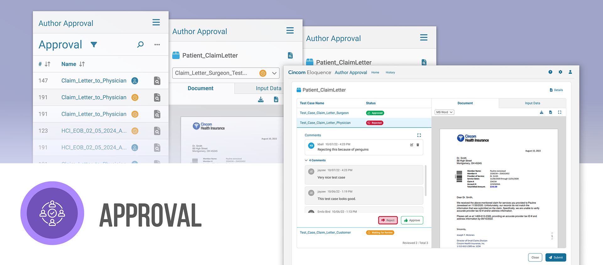
A workflow for business users to get feedback and approval on communication templates - speeding up review cycles and ensuring consistent, compliant communications across the organization.
My Role
Lead UX designer managing 1-2 interns
Conducted unmoderated usability tests
Designed responsive screens for mobile and web
Worked closely with engineering on implementation
Focusing Our Design Efforts
The Author Approval feature was underused due to usability issues - many users had developed workarounds and we wanted to investigate further. This component also represented a strategic opportunity: improving it could help the business attract more customers seeking flexible client approval workflows.
Persona
Authors are business users who design communication templates for print, email, and SMS.

Use Case
An Author creates a single communication template that adjusts content for each state’s regulations. To manage compliance, each variation requires manager approval before the template goes live.

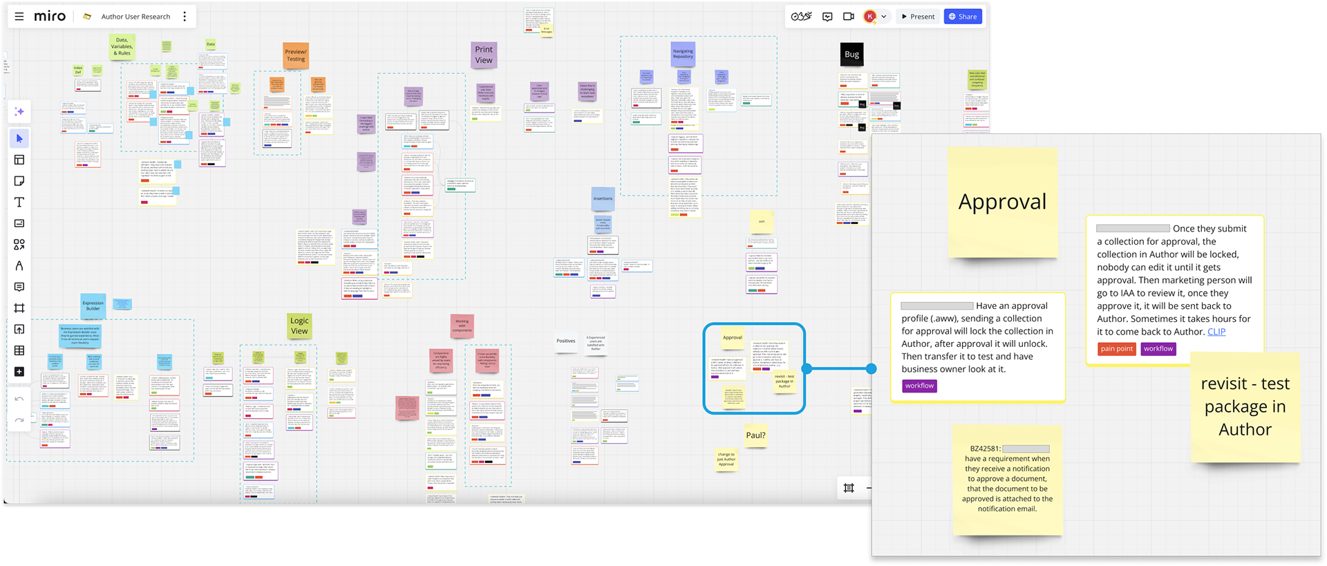
Identifying User Pain Points
We conducted interviews with 6 Authors from different customers.
4/6 users said they had tried to set up Approval but it was too complicated to configure and difficult to use
Because the component was underutilized, we referenced support tickets, usability analysis, and best practices in our redesign
Problem Statement
How might we design a more intuitive approval workflow?
UX Analysis of the Experience
KEY FINDINGS
- There was uncertainty about the steps of the overall workflow and the current step.
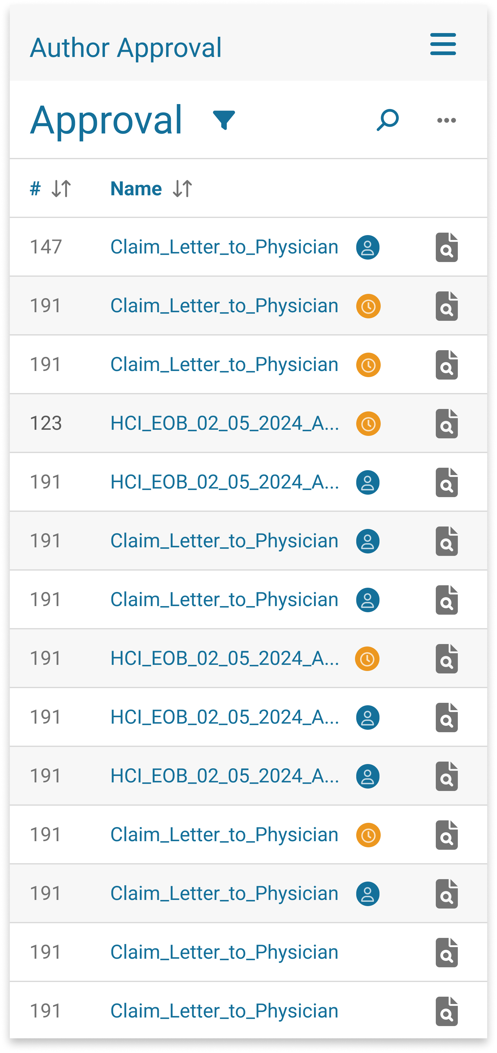
- Approval documents appeared in lists that didn’t make sense, causing confusion.
- Many of the alerts didn’t have significant meaning or value
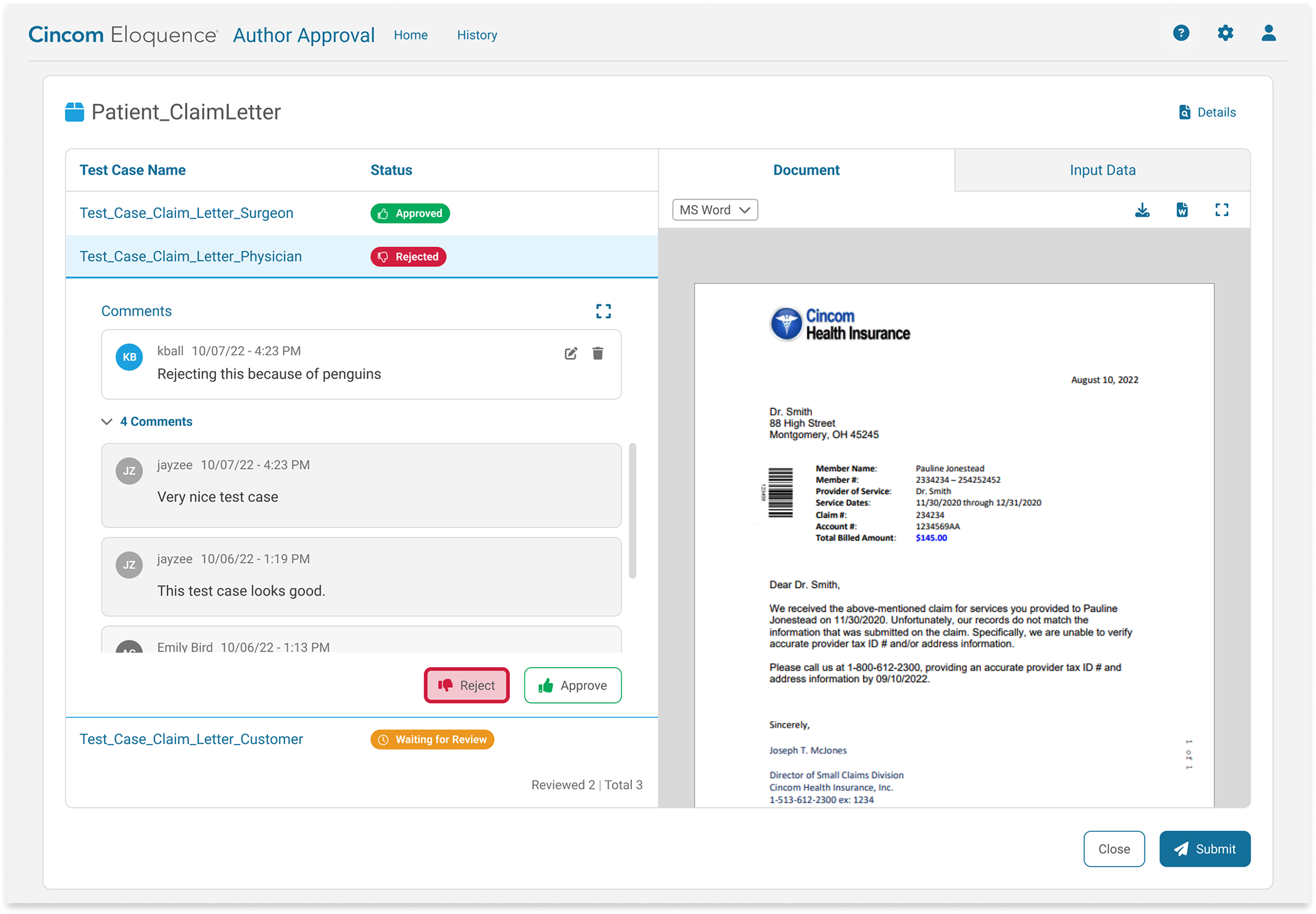
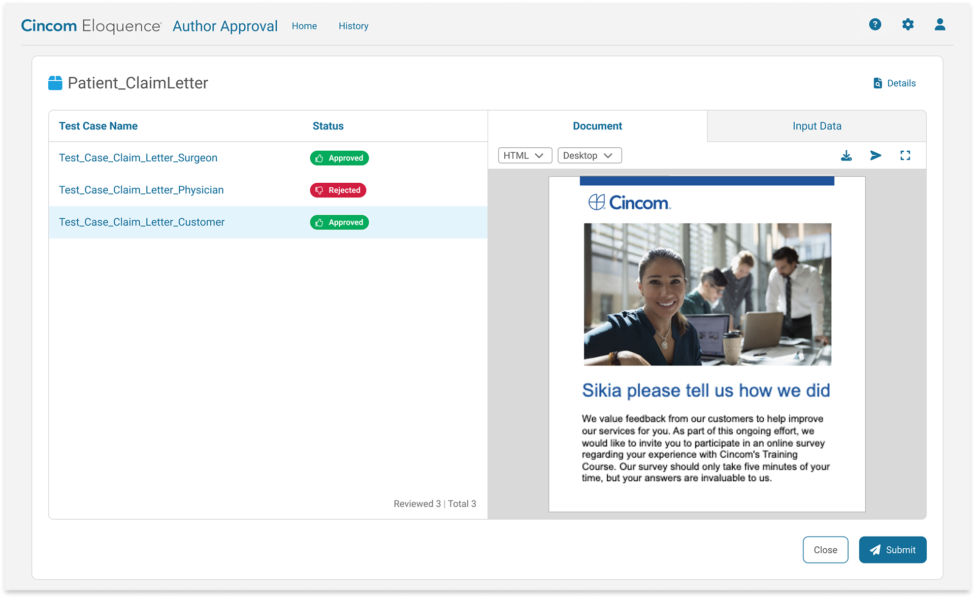
Designing for Complex Approval Workflows
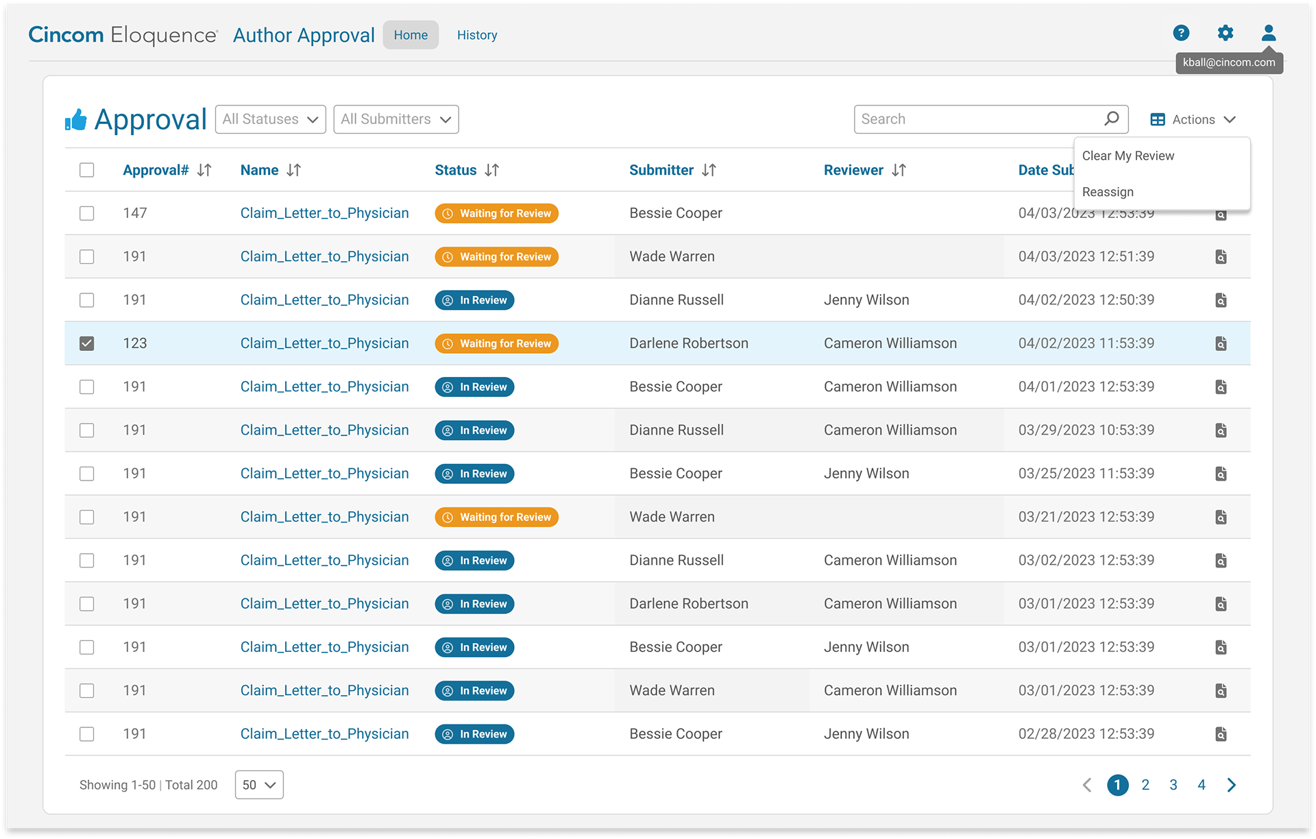
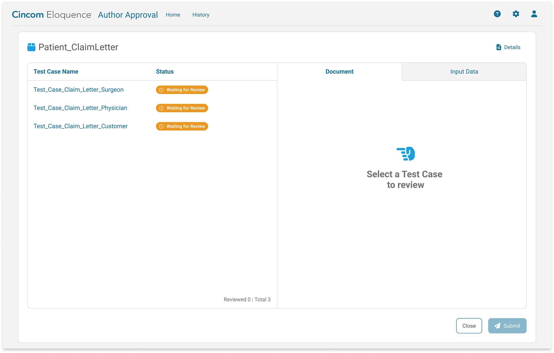
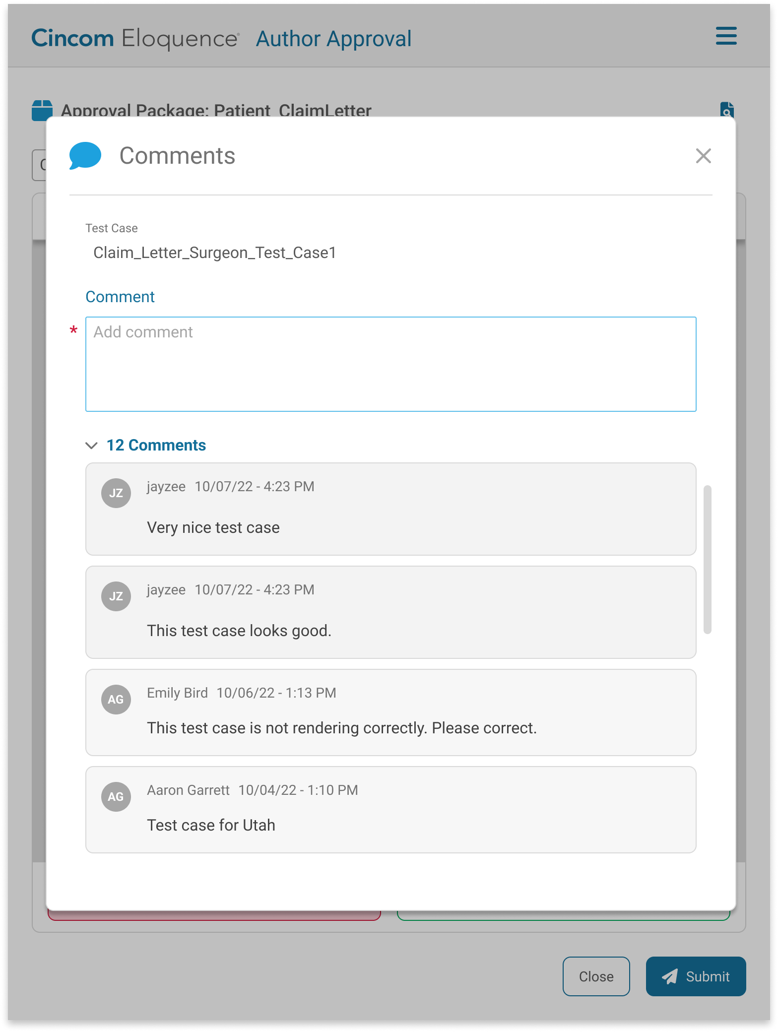
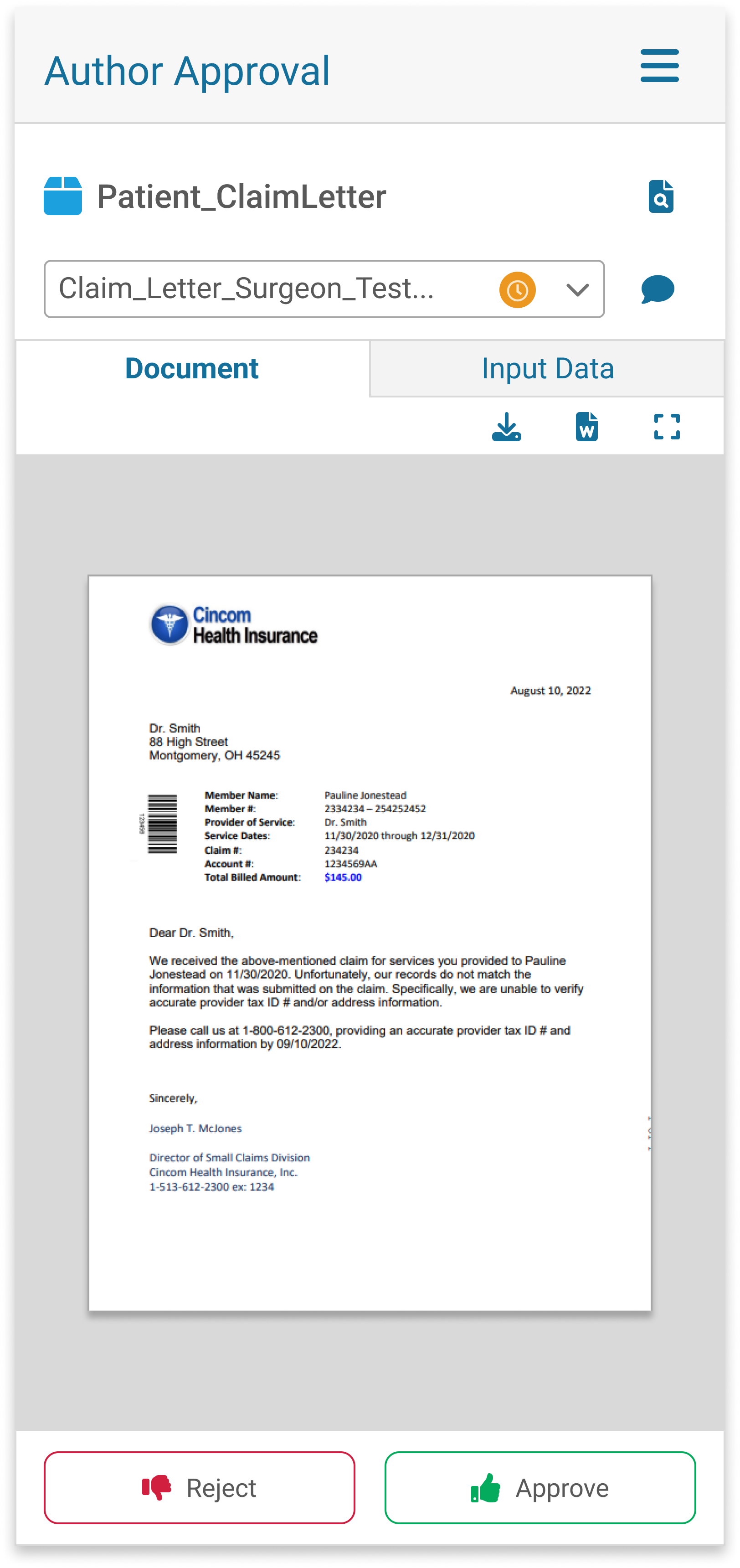
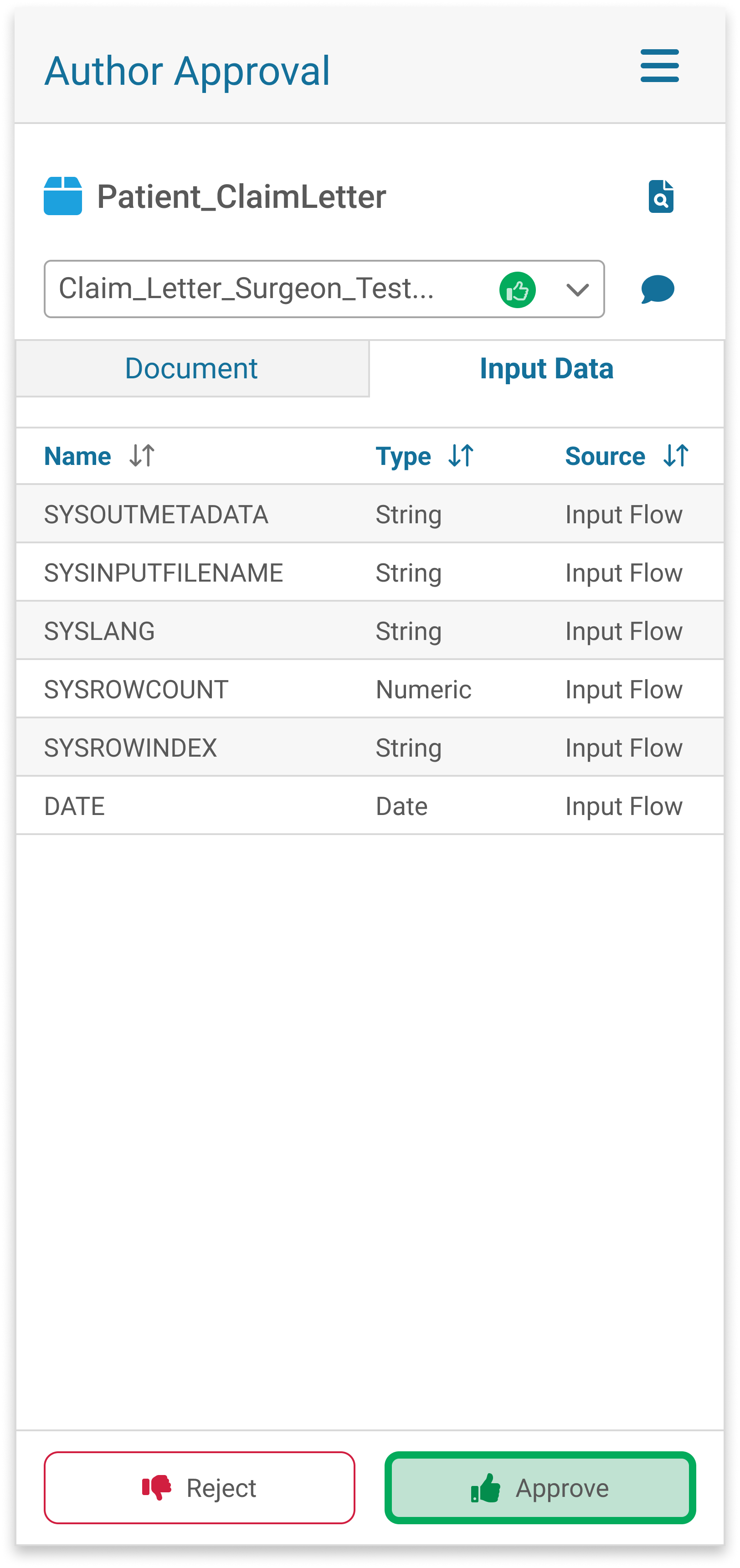
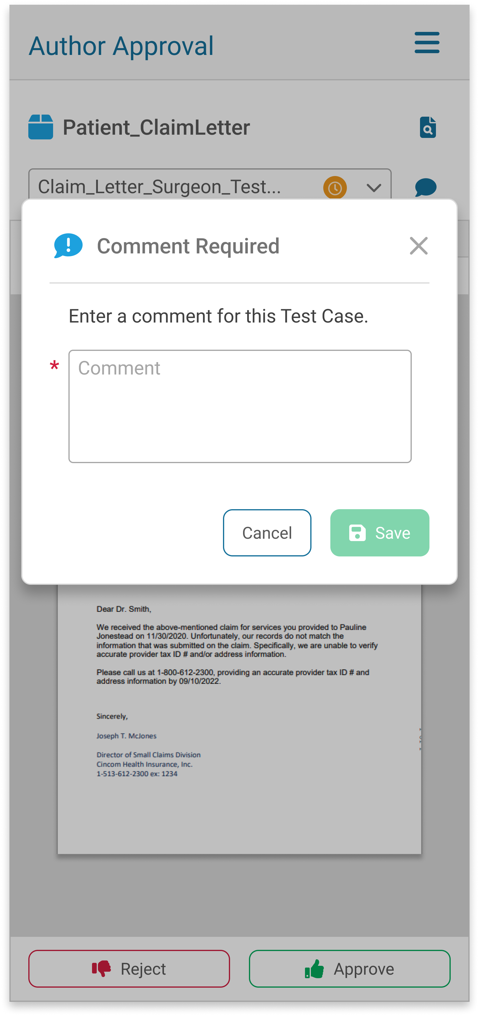
An Author Approval package can include many parts - for example, versions of a communication for multiple states, each with an email and a printed document. Reviewers can comment on any version, and a second reviewer repeats the process. The UI had to be clear, so we ran several rounds of usability testing and iteration during the initial design.
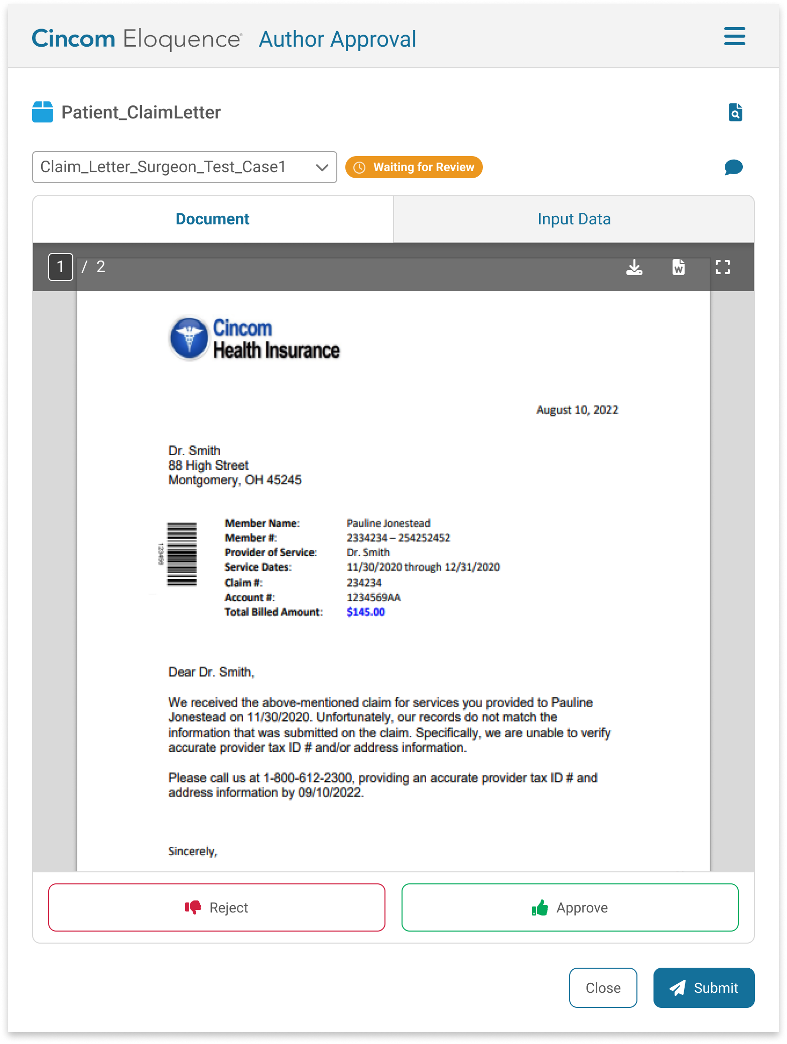
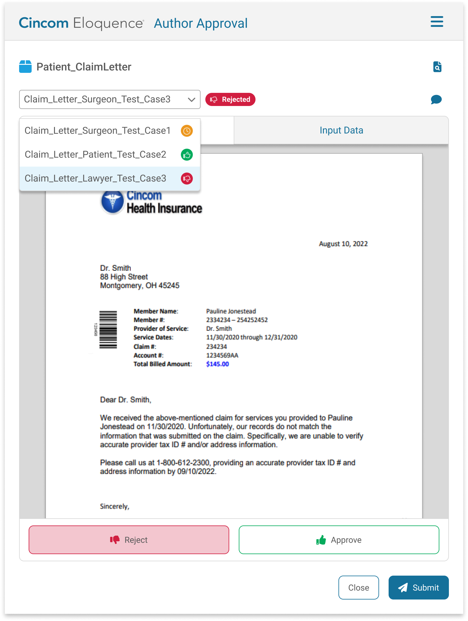
We also wanted this application to be responsive and mobile-friendly, so we created screens for medium and small breakpoints.
Medium Breakpoint

Small Breakpoint
Usability Testing
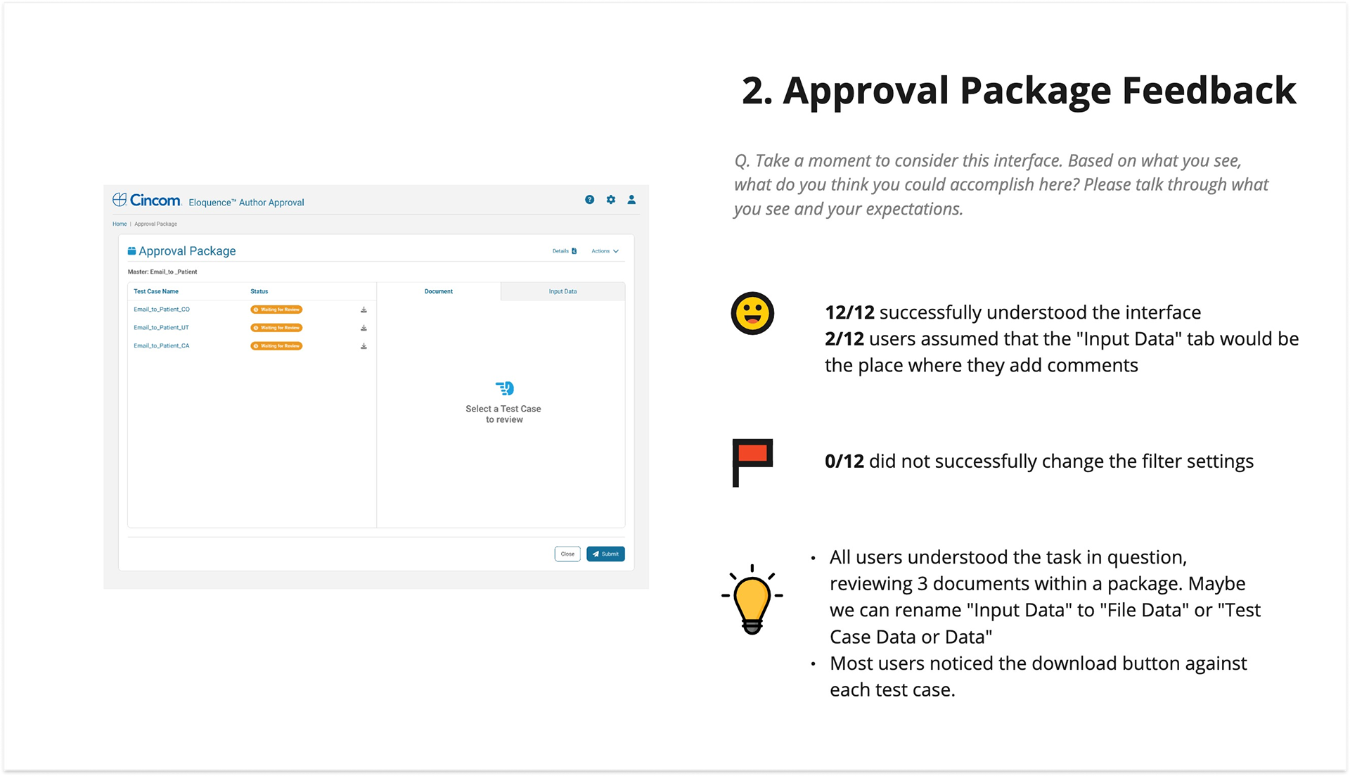
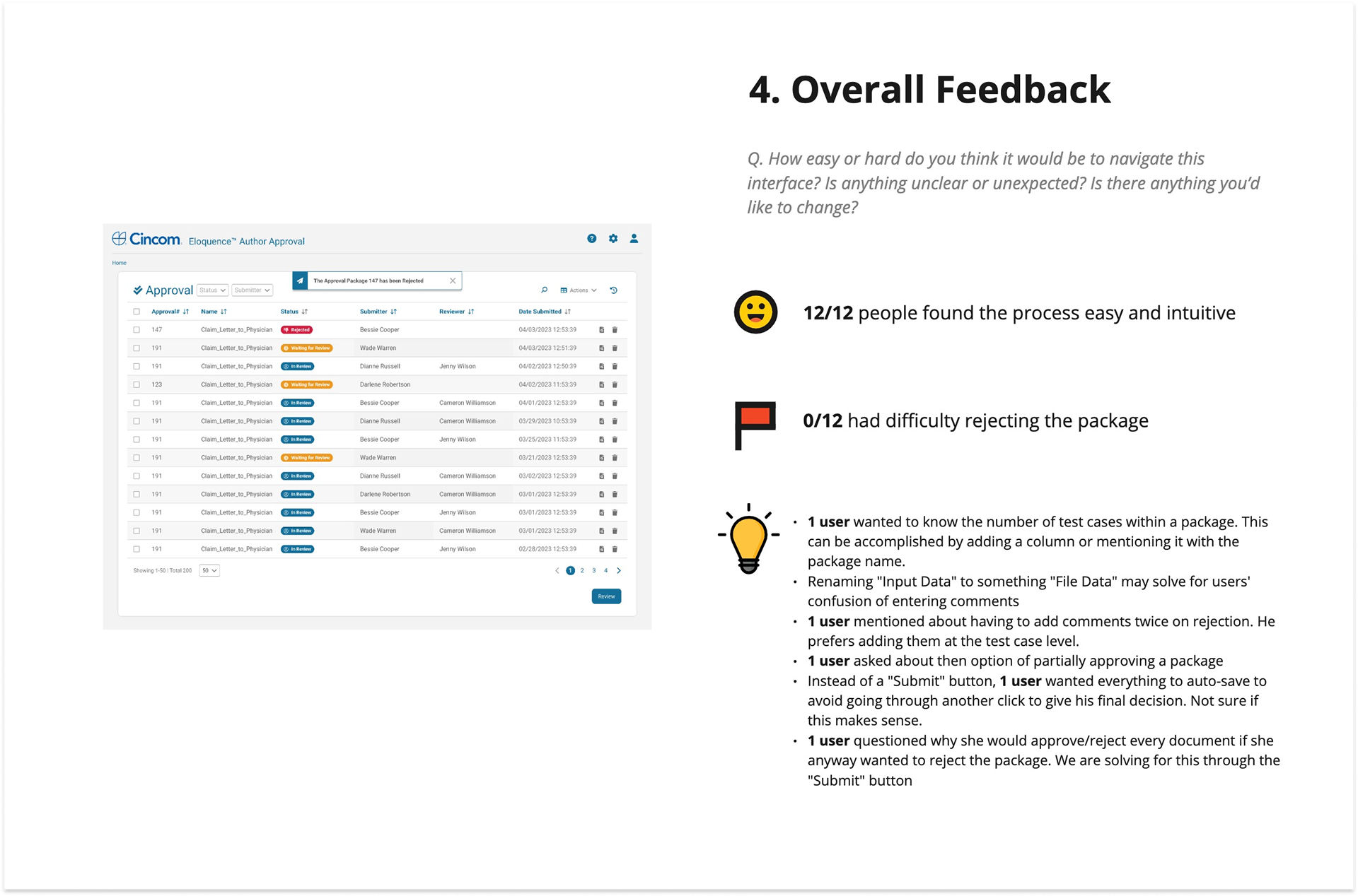
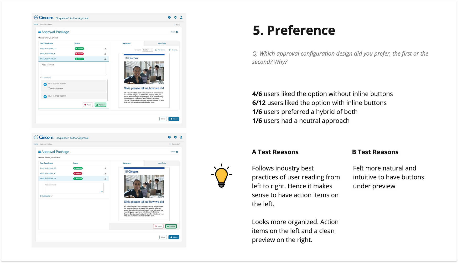
In one of our usability tests, we recruited people who matched our target persona for a balanced comparison study testing inline action buttons vs a fixed button bar.
Testers had additional valuable suggestions and behaviors we observed and used to refine our design.

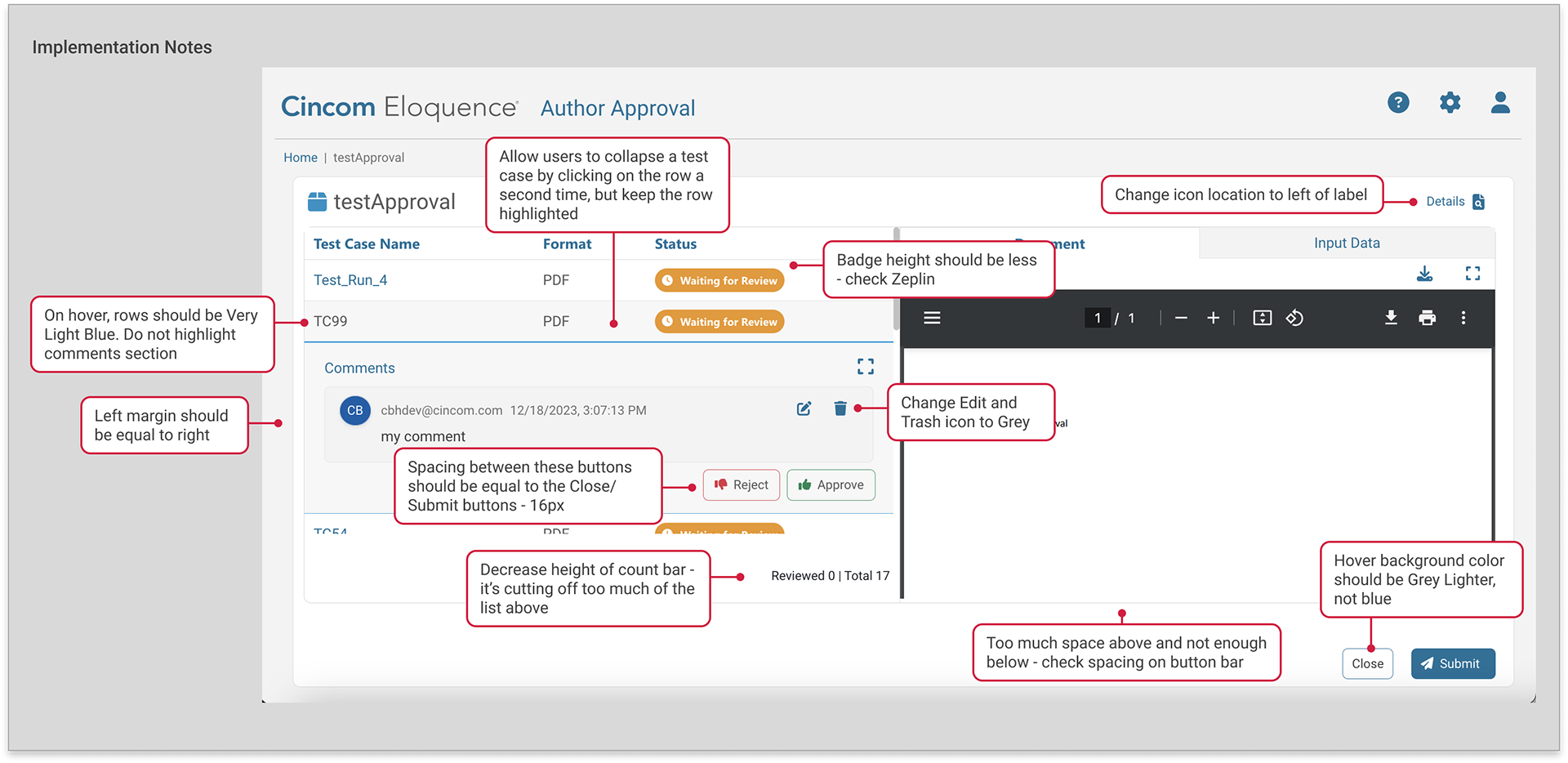
Details details...
Once we had a validated design, there were many behaviors that still needed to be communicated to engineering. There were several rounds of iteration with engineering, as we ironed out the details. Because we took our time with Author Approval, we were much more efficient with redesigning similar interfaces.
Reflection
For this feature - one that many users abandoned - we identified usability issues through internal discovery and secondary research with services and support. While indirect, this approach leveraged feedback on similar workflows and UX best practices to validate decisions and design a more efficient, user-friendly process.