

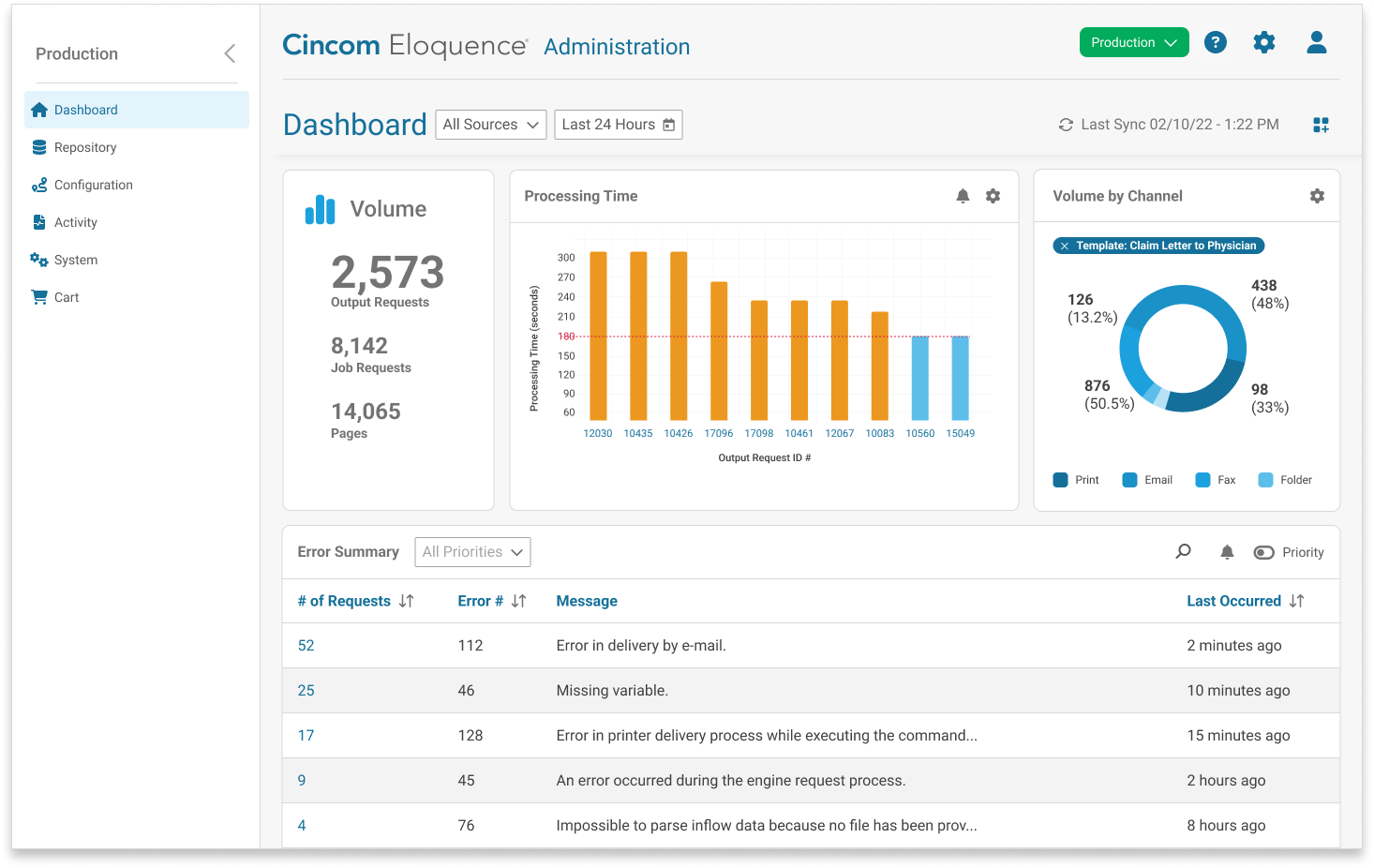
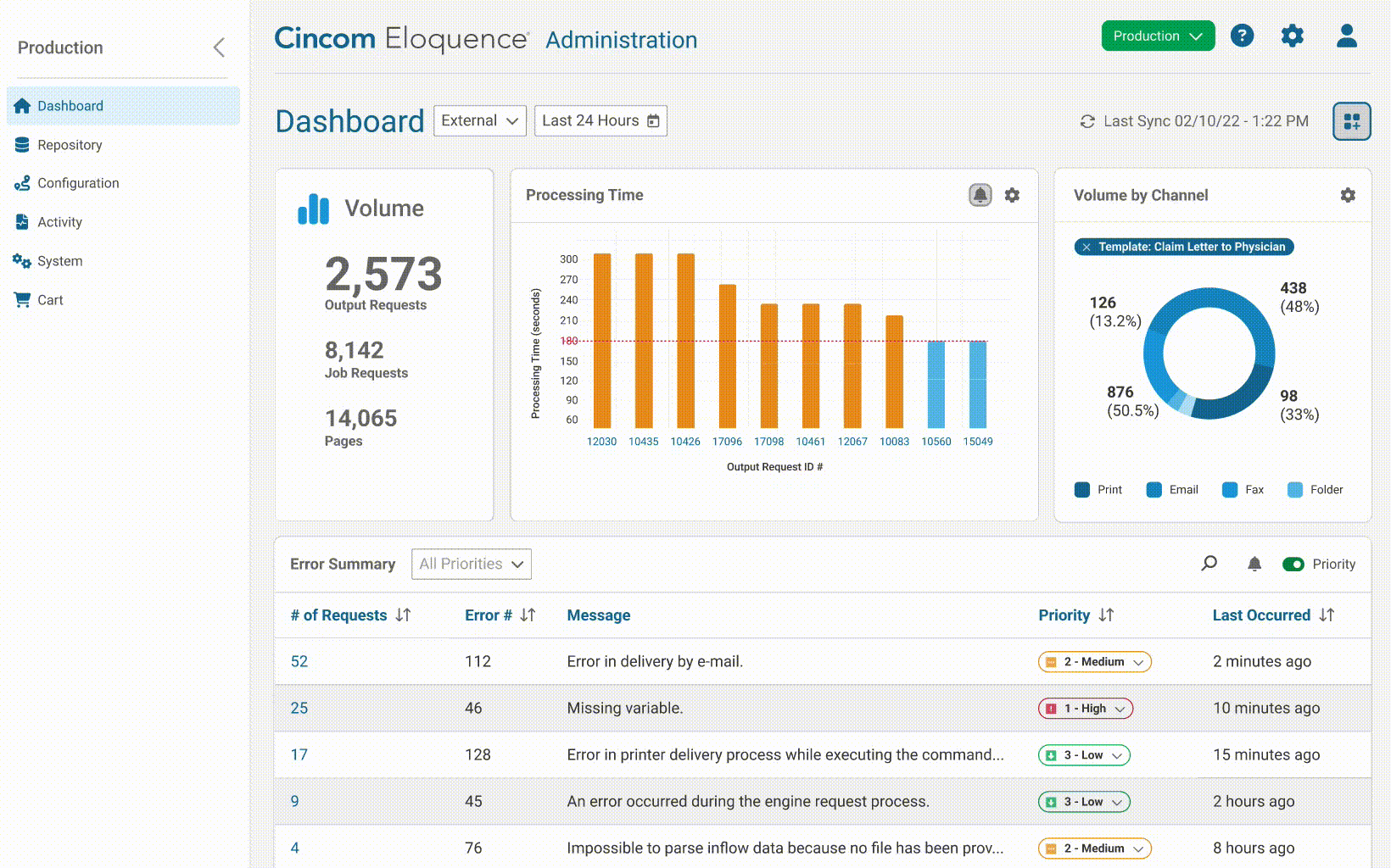
A dashboard and improved troubleshooting workflows that help technical users quickly monitor system health, spot errors, and solve communication issues - turning a complex process into an efficient, insight-driven experience
My Role
Lead UX designer managing 1-2 interns
Led user interviews, card sorts, and co-design sessions
Conducted unmoderated usability tests
Mentored interns on research planning and best practices

Focusing Our Design Efforts
We focused on the application admin experience in response to frequent enhancement requests and feedback from sales cycles. Admin workflows were consistently cited as complex and time-consuming, signaling a clear need for deeper UX research to guide meaningful improvements. We also aligned our design work with a broader engineering effort to re-architect the application. Moving to a cloud-based platform created new opportunities to connect workflows, surface troubleshooting information, and support efficiency.
Persona
Eloquence administrators are technical users who configure communication channels, monitor generated communications, troubleshoot errors, and manage permissions and end-users

Identifying User Pain Points
We conducted interviews with users from 8 different customers to observe their workflows and learn more about their challenges, wants, needs, and motivations.
KEY FINDINGS
3/8 users felt delivery channels are difficult to configure because the workflow is unclear
7/8 users said it's difficult to troubleshoot communication errors because the source may be buried and they get lost in the breadcrumbs
5/8 users mentioned there's no way to know if the system has thrown an error, unless you manually check or build a custom notification tool
Prioritizing the Issues
The UX and product teams prioritized opportunities using three criteria: frequency, value, and feasibility. Improving the error-checking workflow for admins rose to the top. Admins check for errors every day - a high-touch, high-friction task. By streamlining this process, we could reduce frustration and save time across customer operations.
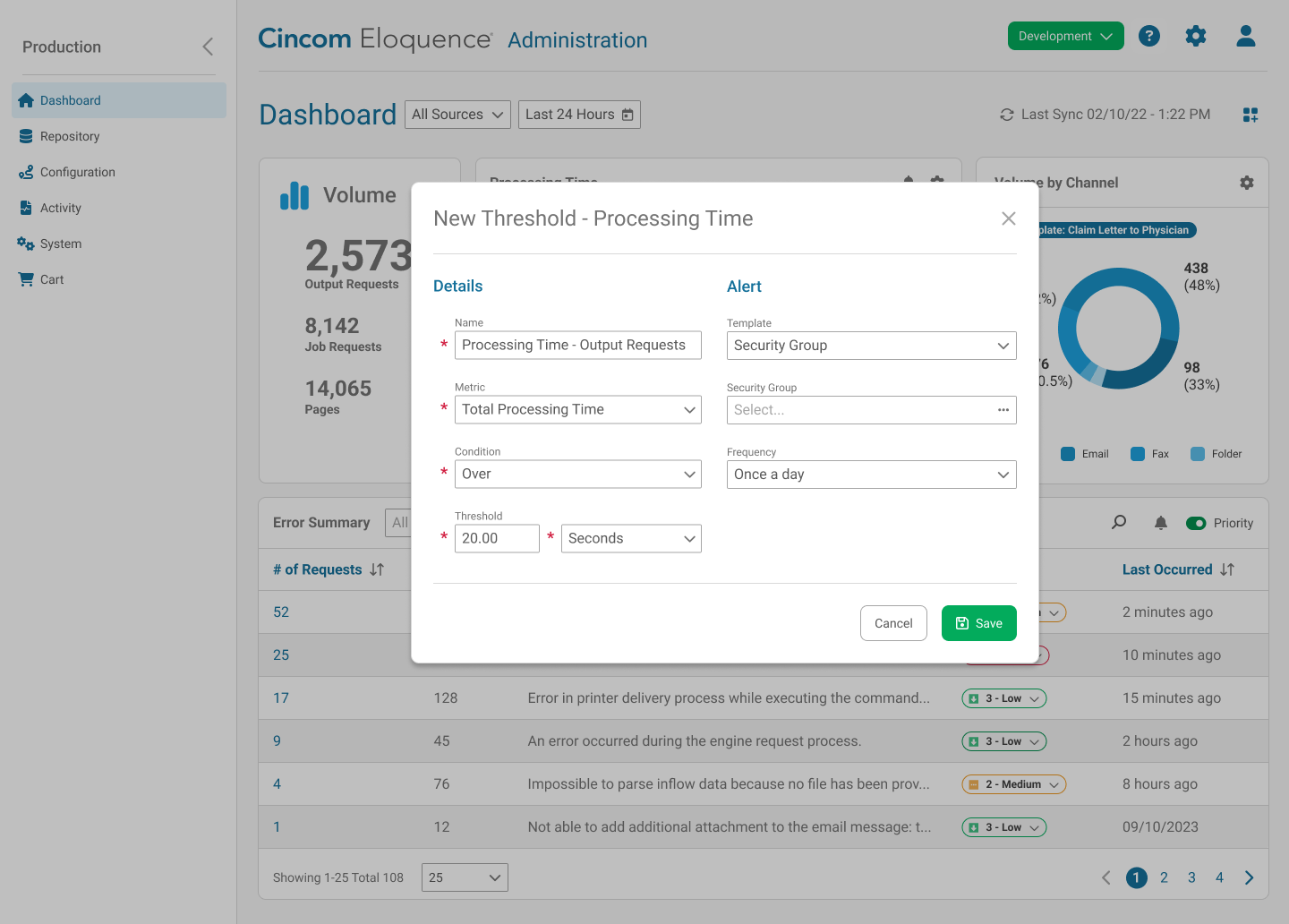
We prioritized this as a high-impact initiative benefiting both users and the business, with robust alerts and reporting planned for a future phase.
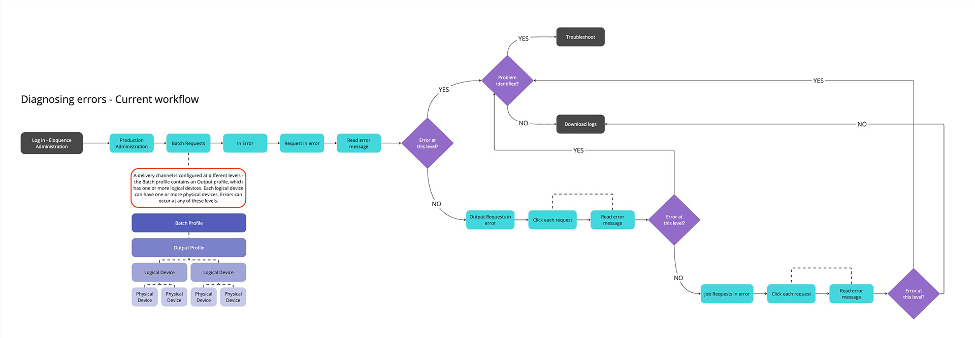
UX Analysis of the Experience
An in-depth usability review revealed how complex the application had become. While its flexible delivery channel setup empowered users, it also made everyday tasks cumbersome.
KEY FINDINGS
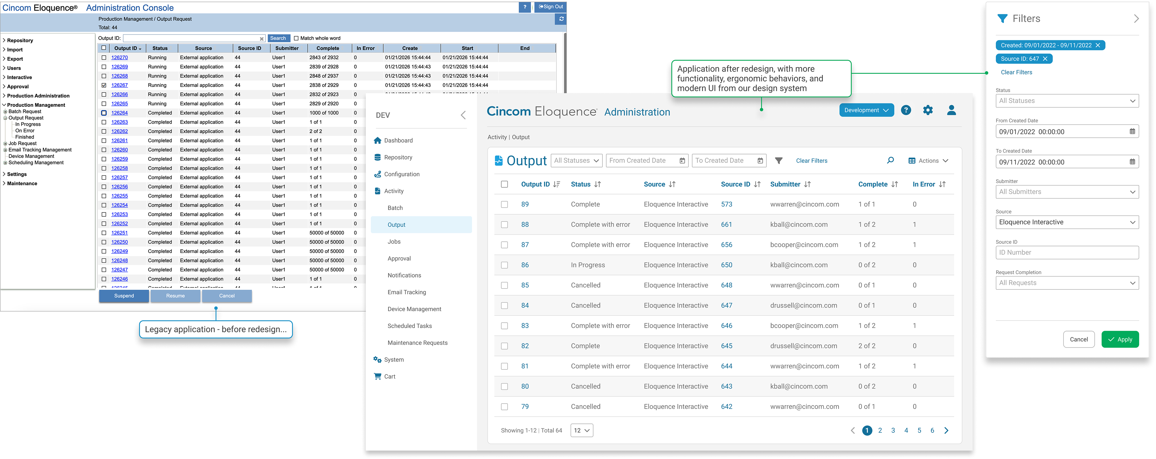
- Data tables lacked basic functionality such as search, sort, filter, and sticky behaviors, creating unnecessary friction.
- Users had to drill deep into navigation paths to locate communication errors, slowing down daily workflows.
- Several customers built their own dashboards to surface errors and monitor key metrics, highlighting a clear unmet need.
Identifying Solutions
By surfacing errors directly and introducing built-in dashboard functionality, we could significantly improve efficiency and reduce user frustration - a technically feasible enhancement with strong business value. We also planned to enhance data tables and logging with best-practice functionality, valuable filters, and connected views to improve usability.
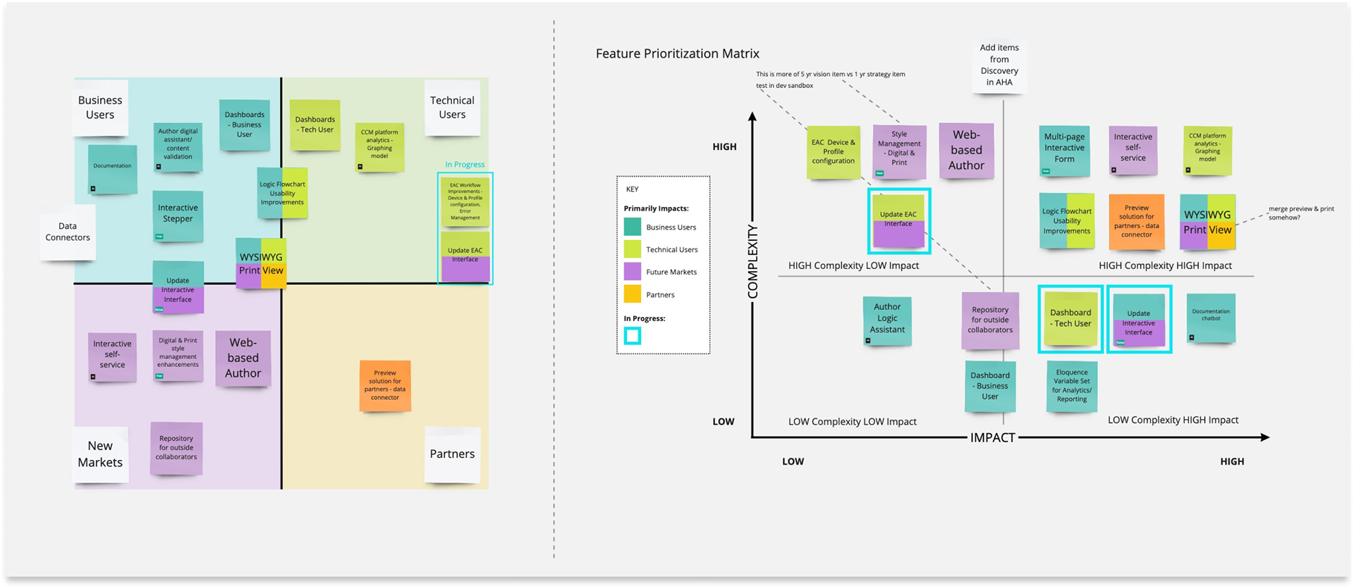
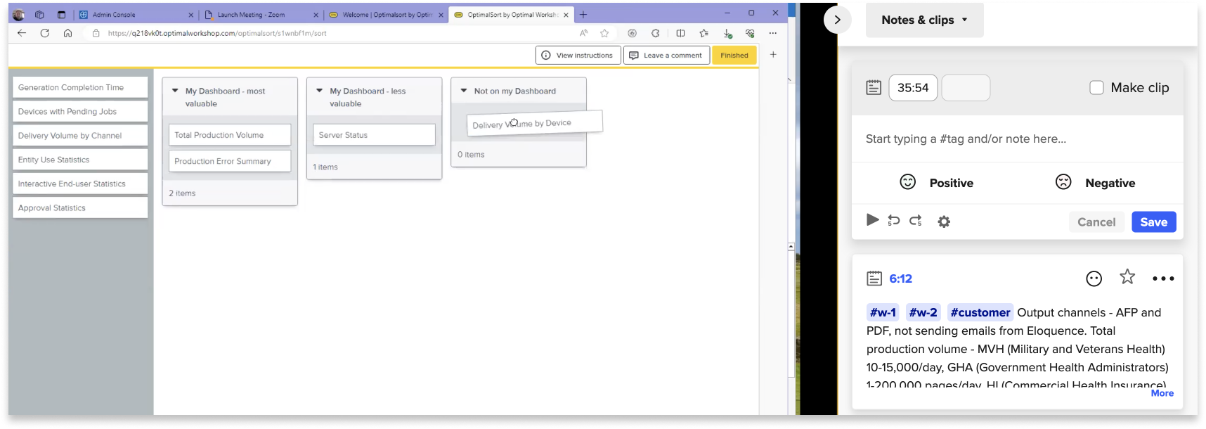
Co-designing with users
With additional user interviews, our goal was to understand which production metrics admins track and how they measure success in the application. Users participated in a card-sorting activity to prioritize dashboard widgets.
Wireframes
We used low-fidelity wireframes during early design sessions with admins as a tool to understand their expectations for dashboard functionality.
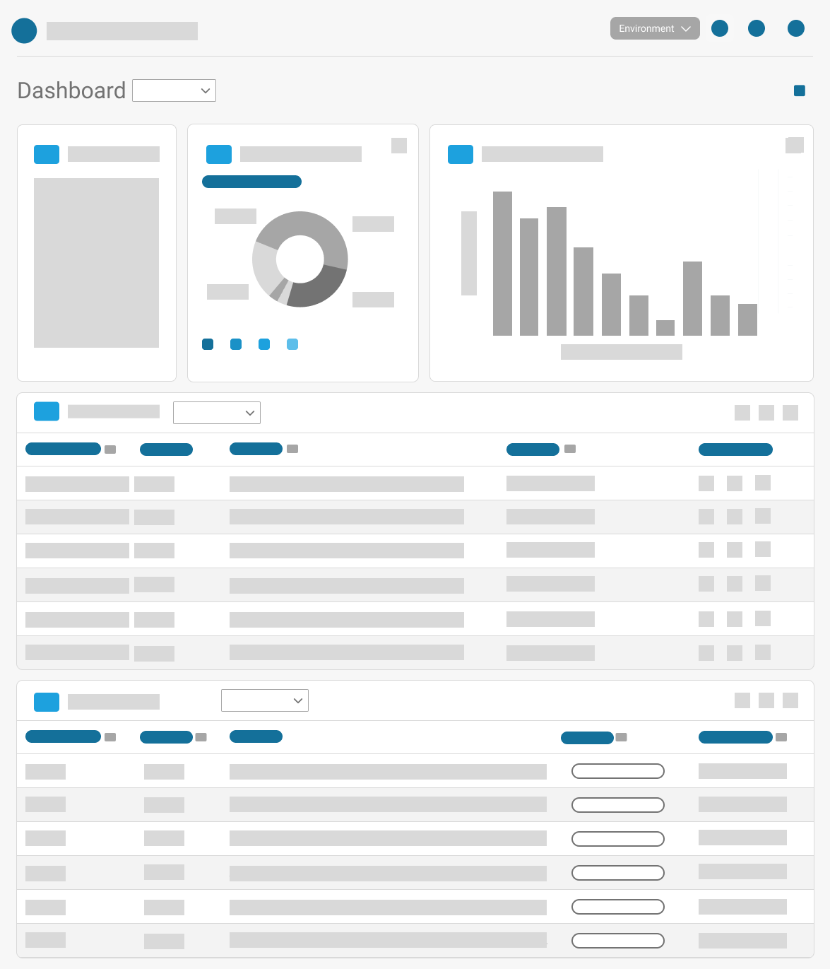
Continued Iterations
Throughout our research process, we leveraged our design system to iterate on the dashboard design, progressing from low to high fidelity screens. We checked in with users regularly to ensure our design matched their mental models and fulfilled their business needs.
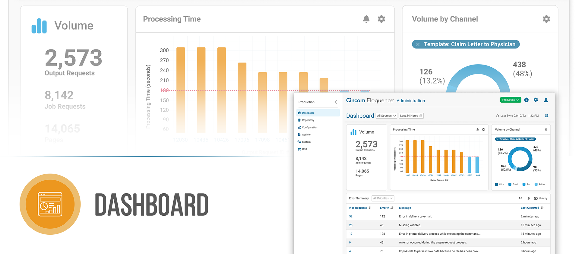
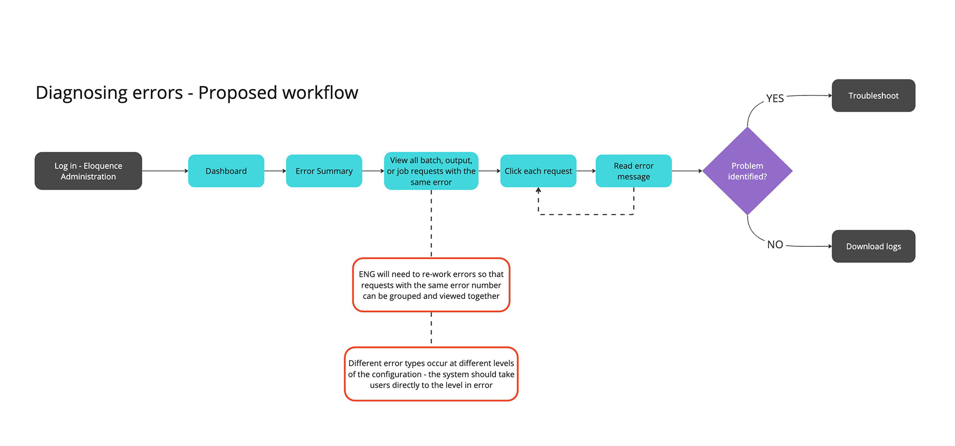
End-to-End Experience
The new dashboard surfaces errors, making it easier for admins to navigate directly to the source. But users often need broader context, not just a single error, to understand what's happening in the system. To support this, we:
- Enhanced existing data tables with more functionality and a cleaner, more readable interface.
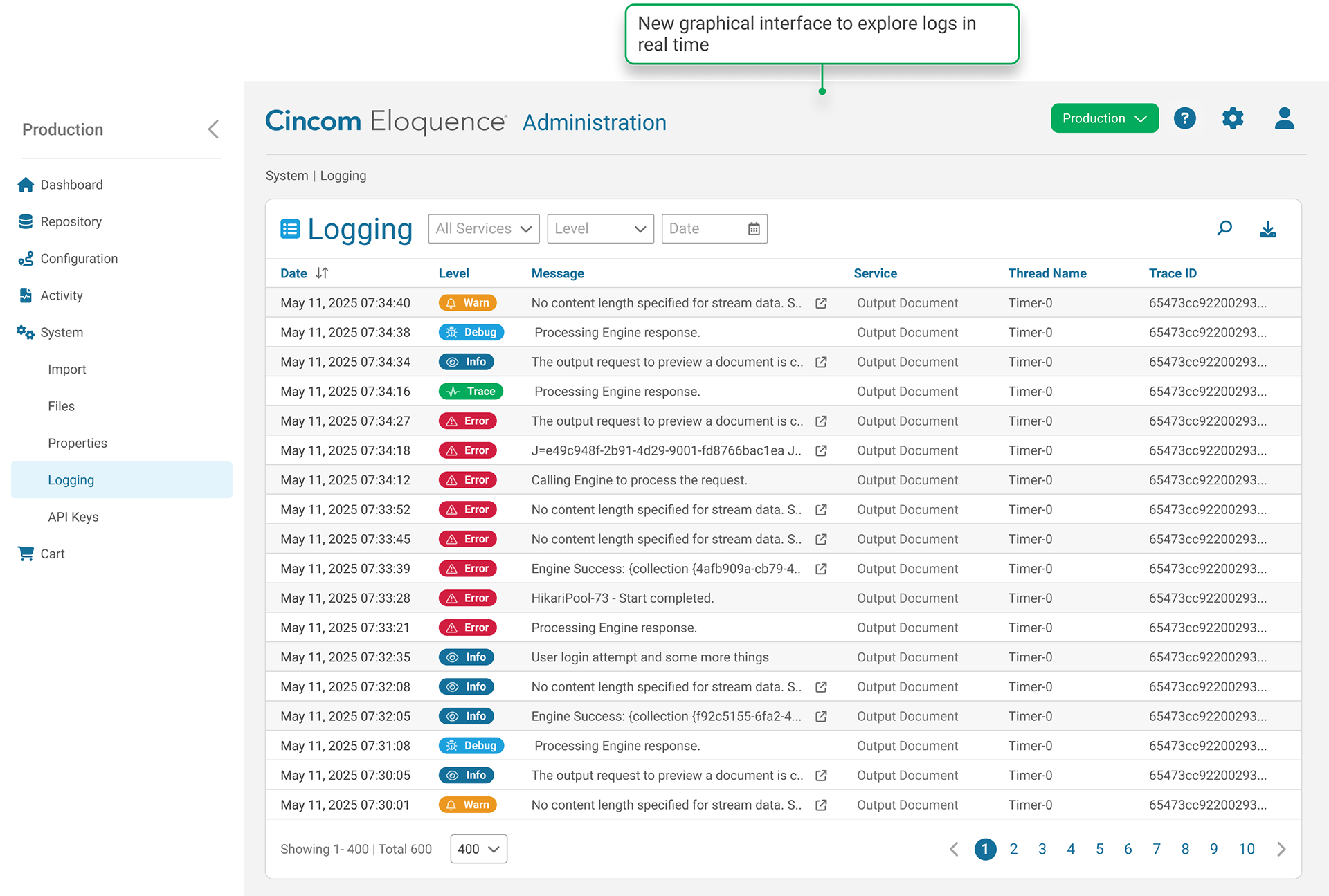
- Implemented a graphical view of system logs so users could explore activity in real time instead of downloading logging files.
- Hyperlinked references in error messages to connect related views, allowing users to move between the dashboard, logs, and tables.
- Reinforced breadcrumbs and navigation buttons in our designs.
By linking these workflows together, we addressed the full end-to-end troubleshooting experience and significantly improved efficiency for admins.
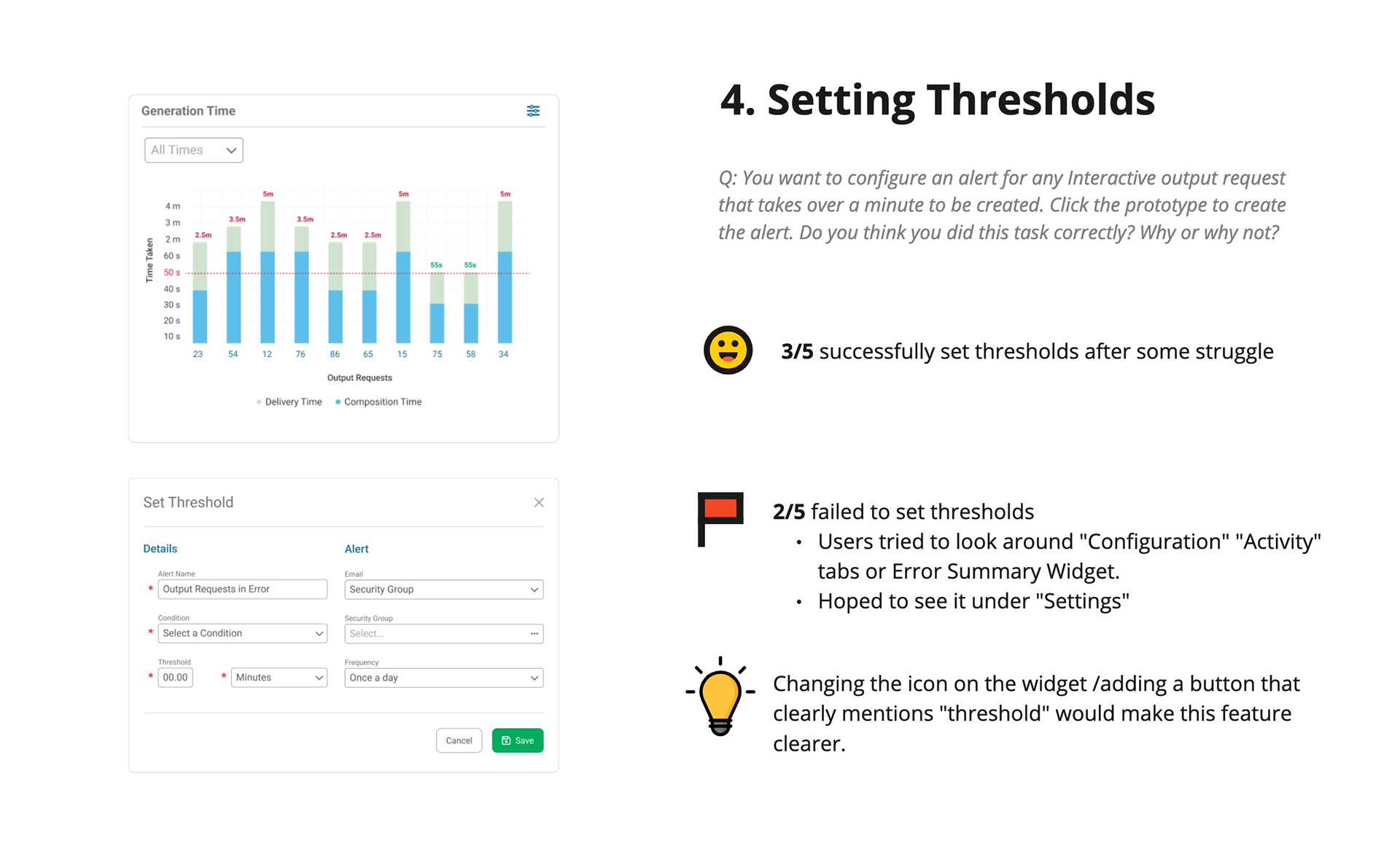
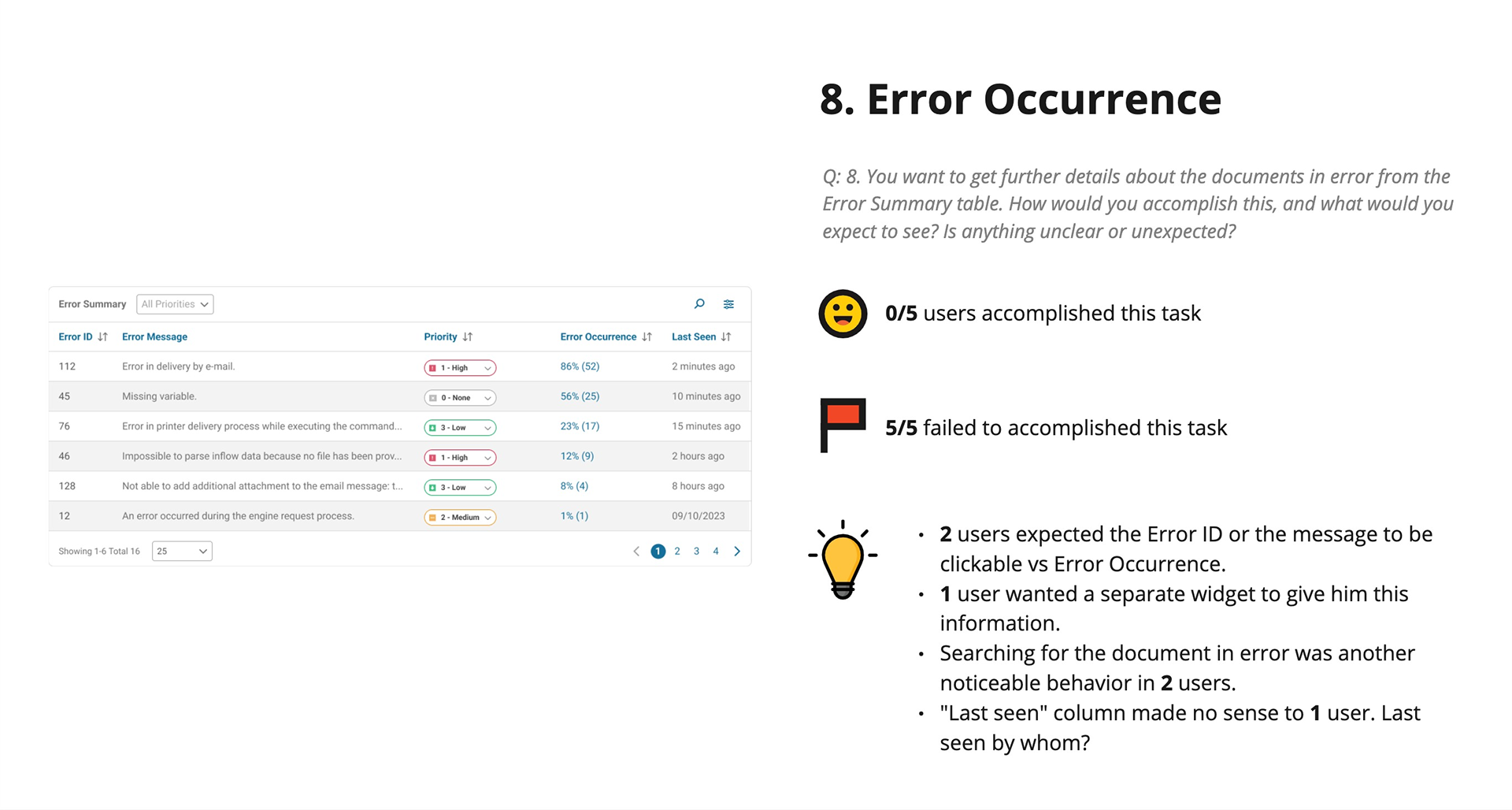
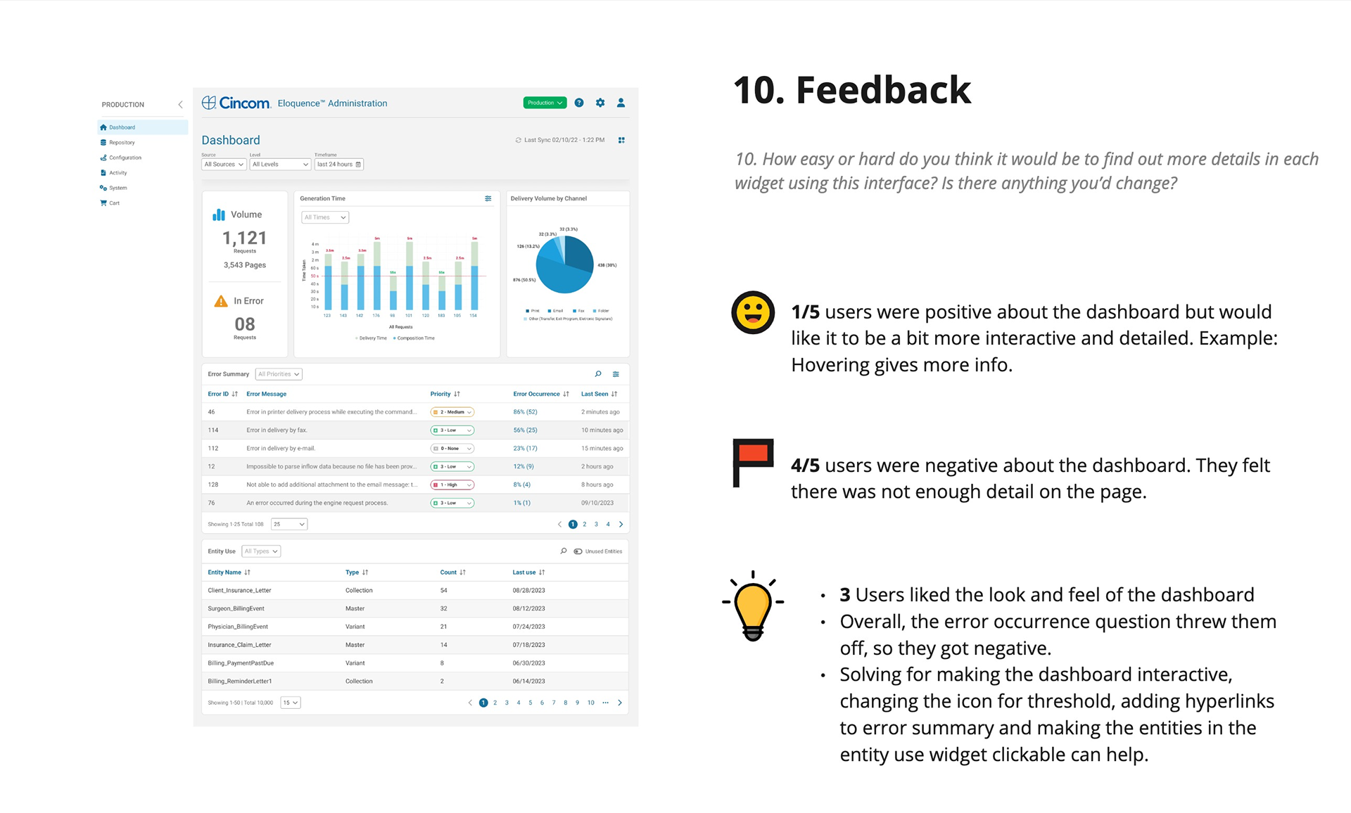
Unmoderated Usability Testing
Once we had validated, high-fidelity screens, we built a prototype of the dashboard and key workflows for usability testing. 5 participants who matched our target persona performed tasks with our prototype, and we used their insights to refine our designs.
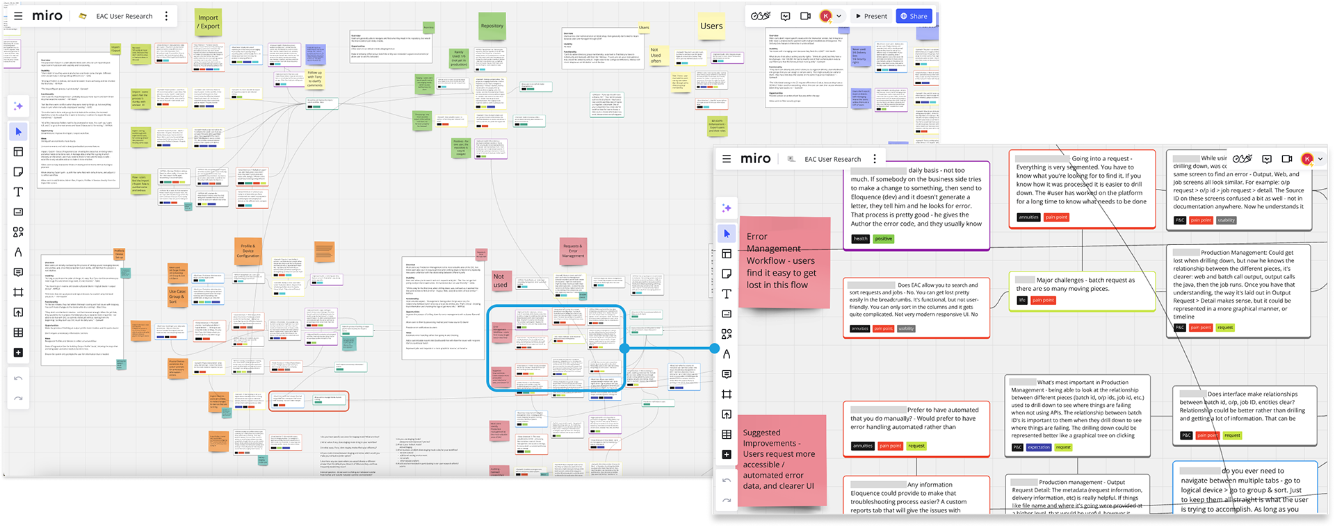
Usability Research Insights
We shared the findings from our usability testing with engineering and stakeholders to create transparency around our design decisions. Below are some of the slides we presented to walk through user feedback, pain points, and supporting data. This approach helped us build buy-in and alignment across teams.

Outcome
Extensive research, co-design, and usability testing allowed us to refine requirements before development, helping the team avoid costly rework and ensuring we deliver value. Full customer validation is pending due to slow adoption of the new cloud-based platform, but internal teams including services and support responded positively to the redesigned workflows.
Our work addressed long-standing pain points that were difficult to solve in the legacy application. Now, new customers onboarding directly to the cloud-based application should have a much smoother experience. We will focus on these customers and existing customers who have migrated for follow-up usability testing.
Reflection
From the start, our goal was to design a dashboard and supporting views that provide real operational value - not just visual appeal. With a wide range of customers and business needs, flexibility was key. For the first release, we focused on delivering essential, high-impact metrics out of the box and linking them directly to the workflows and data that admins rely on to troubleshoot errors. We also enabled behavioral analytics for future design iterations. This approach balanced immediate business impact with a scalable foundation for advanced capabilities in later releases.