
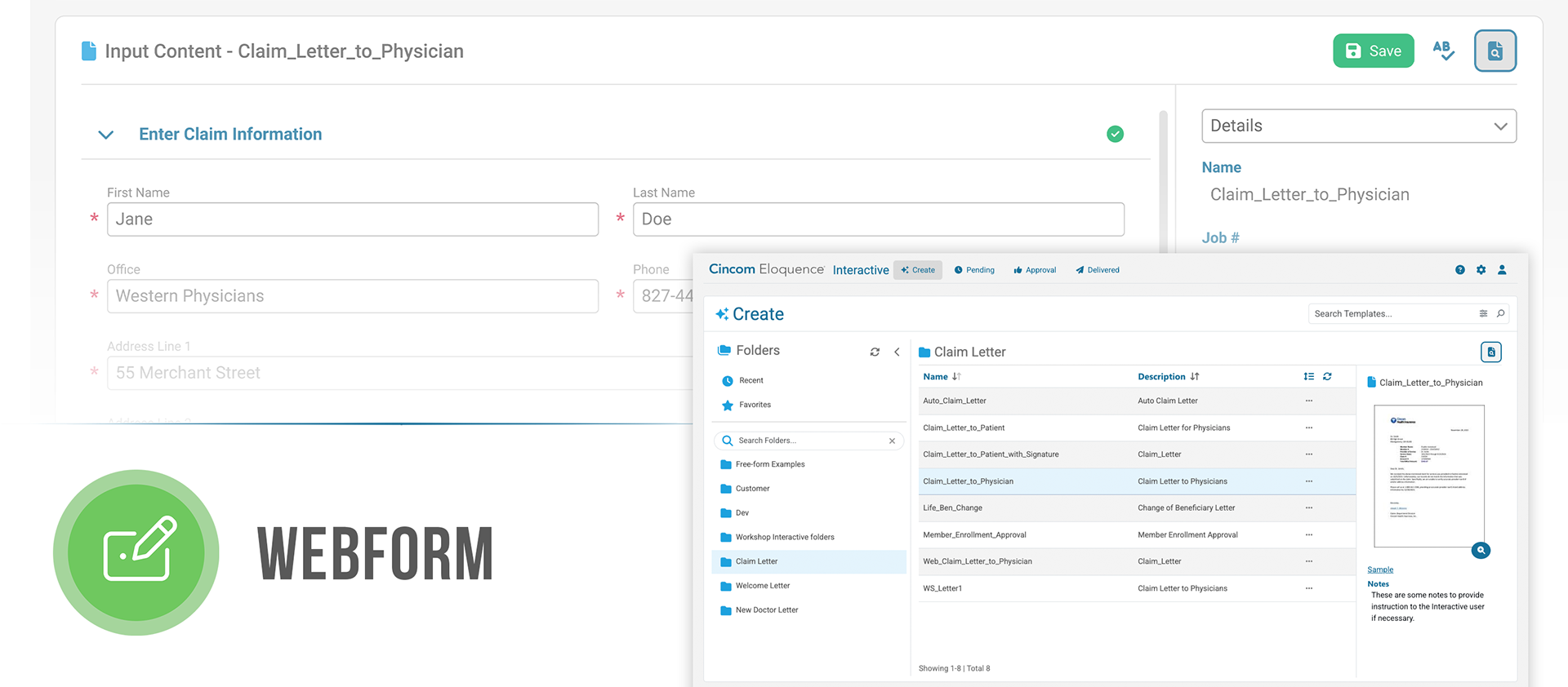
A customizable webform workflow for generating communications – redesigned to be flexible, modern, and accessible
My Role
Lead UX designer managing 1-2 interns
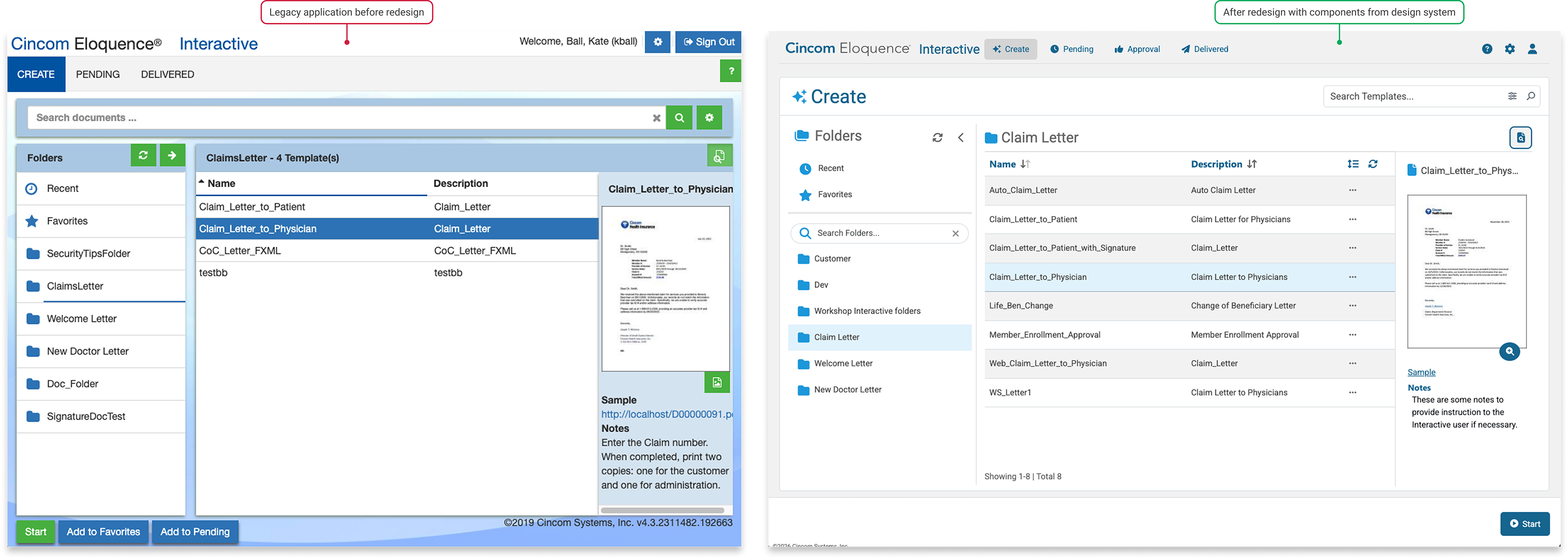
Redesigned UI using our design system
Corrected experience issues with UX best practices
Worked with developers on implementation
Managed and added to design system
Focusing our design efforts
We focused on this component of the larger enterprise application because it has the most users, it is demoed to prospects frequently, and the legacy UI needed a modern refresh. In addition to redesigning the UI, we took this opportunity to implement best practices for webforms and accessibility. We also improved our design system along the way.
Persona
Customer service reps working in a call-center and insurance agents are just a couple of the many types of users who use this workflow to do their jobs. They interact with their customers and generate custom communications such as claims documents, explanations of benefits, and bills.
Design Challenges
We tackled this redesign with a few things in mind:
1. Simplicity is key – these users are not technical, and the workflow should be as intuitive as possible so that training is simple
2. A need for speed – our customers want to be able to generate communications rapidly, in as few clicks as possible
3. Communications may be complex – even though the workflow is simple, many of our customers’ communication templates are long and complex
4. It’s a multi-step process – users need to be aware of their progress, the status of approval requests, and delivery issues
UX Analysis of the Experience
We conducted a detailed review of the experience. The workflows and functionality are highly customizable, and we found that our customers utilize a wide range of the features. Some had a limited number of buttons exposed and some had every button and feature turned on. We evaluated the heavy feature usage scenario first, while considering configurations that were a little lighter.
KEY FINDINGS
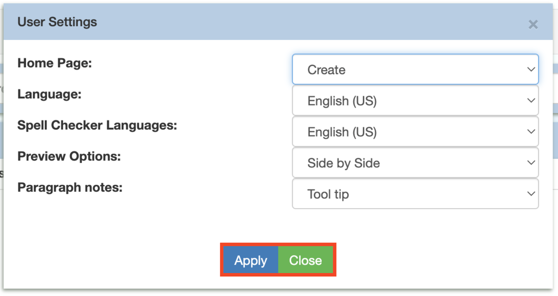
- Action buttons were “dumped” at the bottom of the screen, without proper hierarchy, and existing button styles were inconsistent
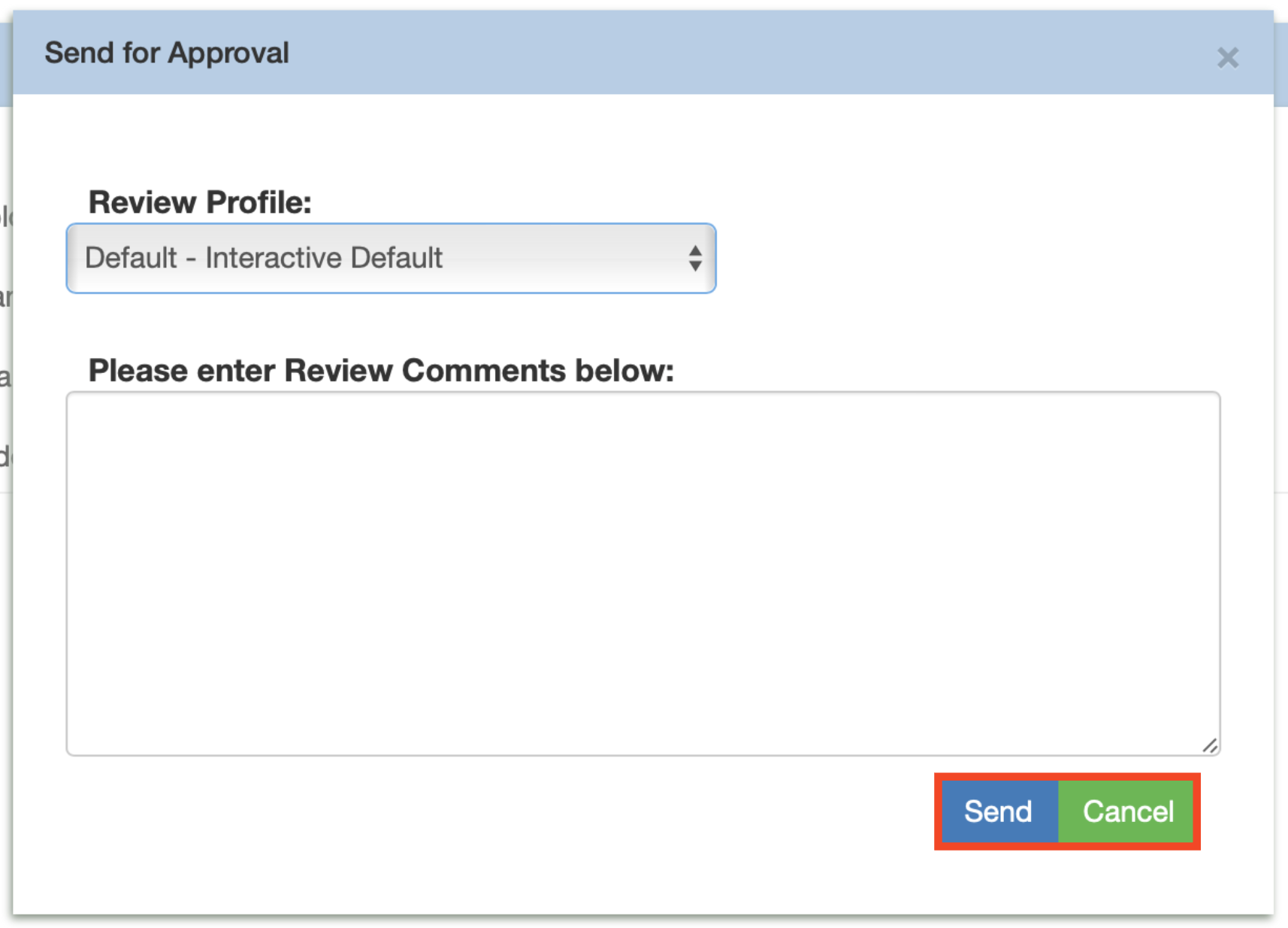
- Comments and statuses were buried or inaccessible for end-users
- System feedback was insufficient
- Some controls were cumbersome to use
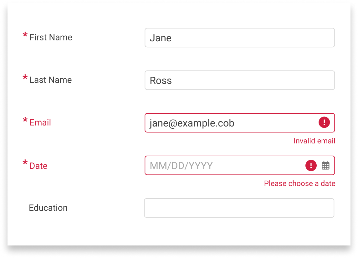
- Error flows did not follow best practices

Designing Solutions
To address our key findings, we implemented the following best practices:
- Defined button styles and hierarchies, and moved less frequently used actions to less prominent areas of the UI
- Ensured time-sensitive notifications were highly visible and dismissible to reduce backlogs
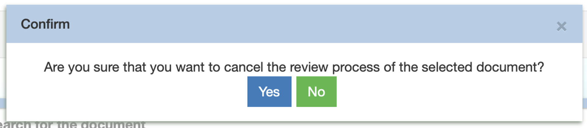
- Added system feedback, like alerts and confirmation messages where they were missing and replaced validation summaries with “toast”- style alert messages
- Redesigned controls for better ease of use and accessibility
- Refined input and form behaviors so that errors are easy to understand, find, and fix
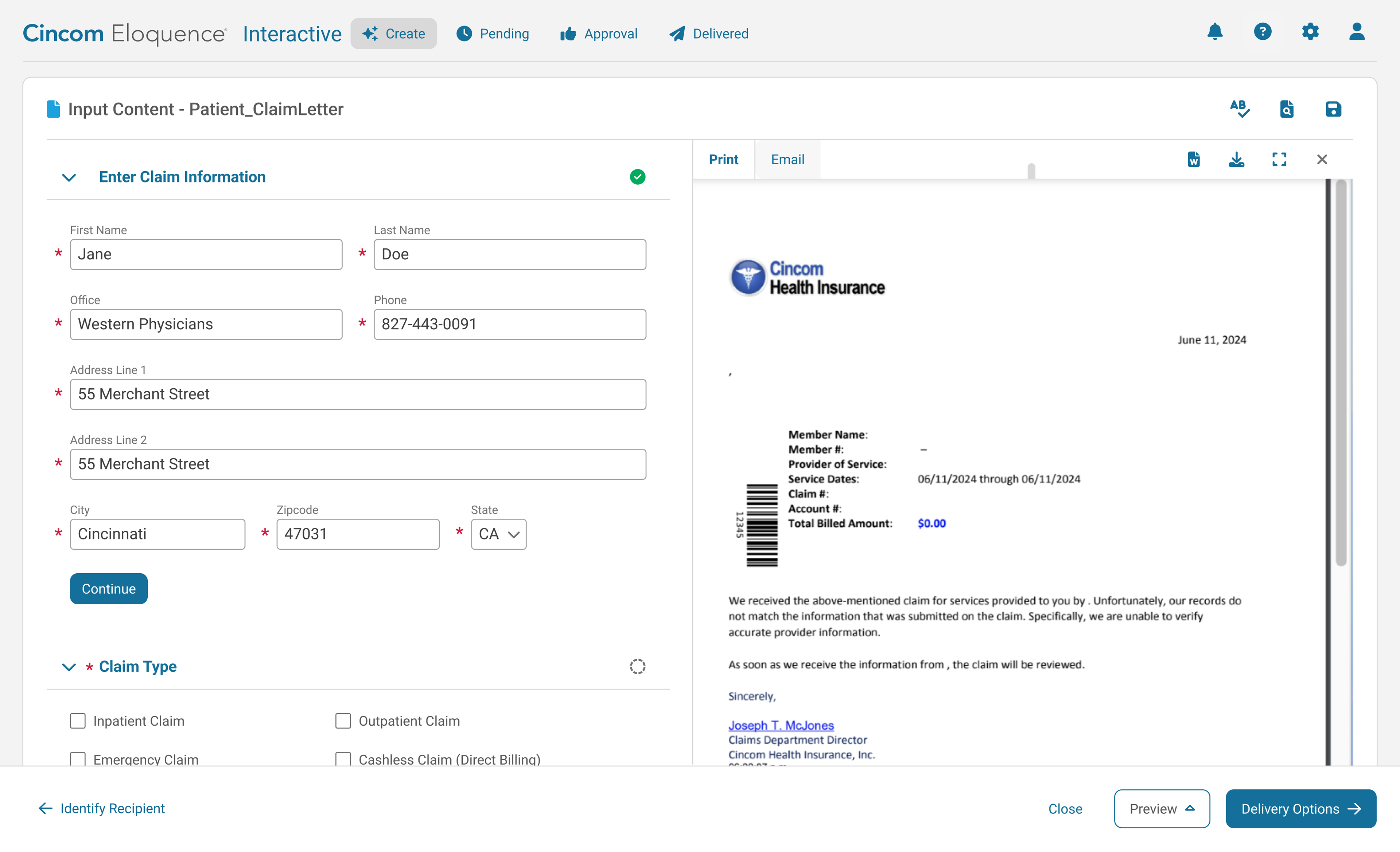
Co-designing with Users
Redesigning controls: Double checkboxes
The problem: end-users may need to select something like a recipient or an attachment from a dynamic list of options. They may also need to reorder the list, delete a row, or add a new one. These options are all configurable and dependent on dynamic input data.
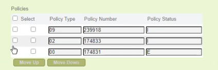
The result for many of our customers was that they saw two unlabeled columns of checkboxes on their tables, with no way to tell which was for table controls and which was to include the row. These customers were annoyed by the double checkboxes because it caused a lot of confusion and mistakes:
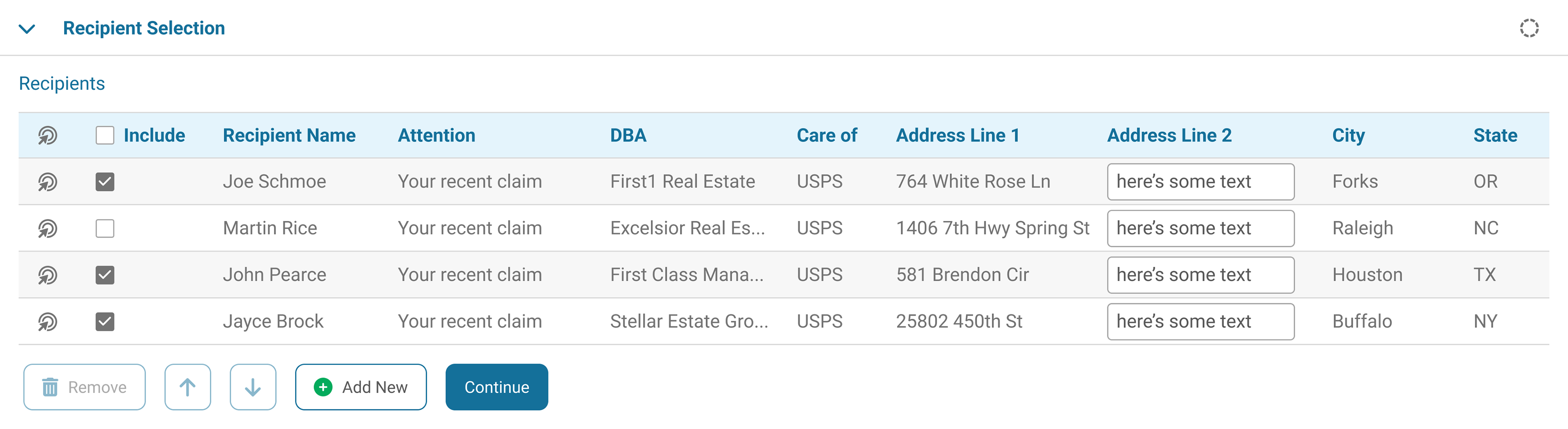
Iterations: this design went through several iterations and meetings with customers to get their feedback. We realized there were two distinct use cases - basic lists where users just needed to reorder, and lists with all of the more advanced functionality. The challenge was to distinguish selection from inclusion, and ensure everything was intuitive, uncluttered, and accessible. We steered away from a more complex table editing mode - although it helped separate list editing from including records, it was overwhelming for users with simpler use cases.
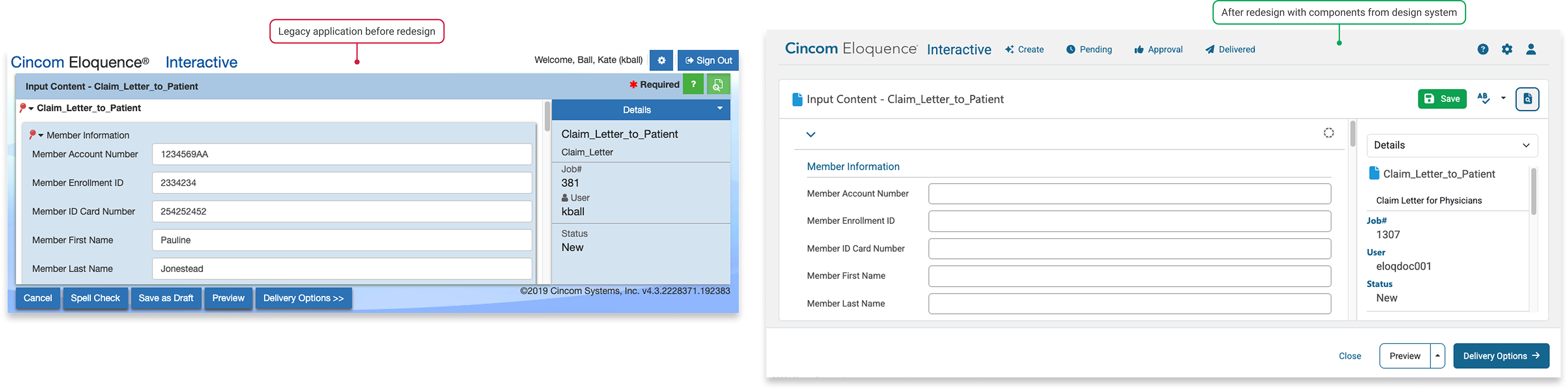
Solution: the table control column with checkboxes was replaced with a selection icon button. The UI was updated with components from our design system for a cleaner, more readable look:
Implementation
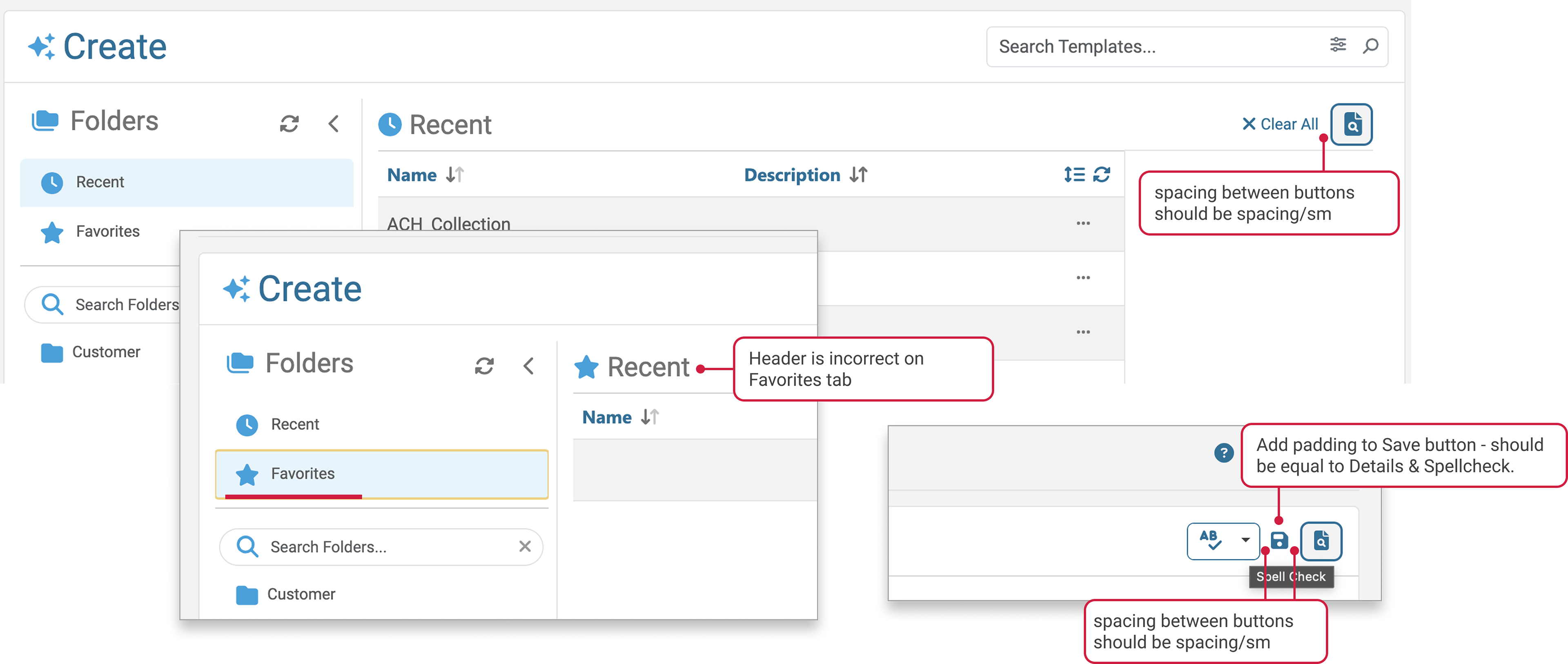
- We worked closely with frontend developers to get the details right, ensuring spacing, padding, colors, behaviors, states, responsiveness, and branding were correct
- The new UI included complex webforms, data tables, schedulers, previews, etc.
- We supported testing and review of accessibility of the implemented UI and code, following 2.1 AA WCAG guidelines
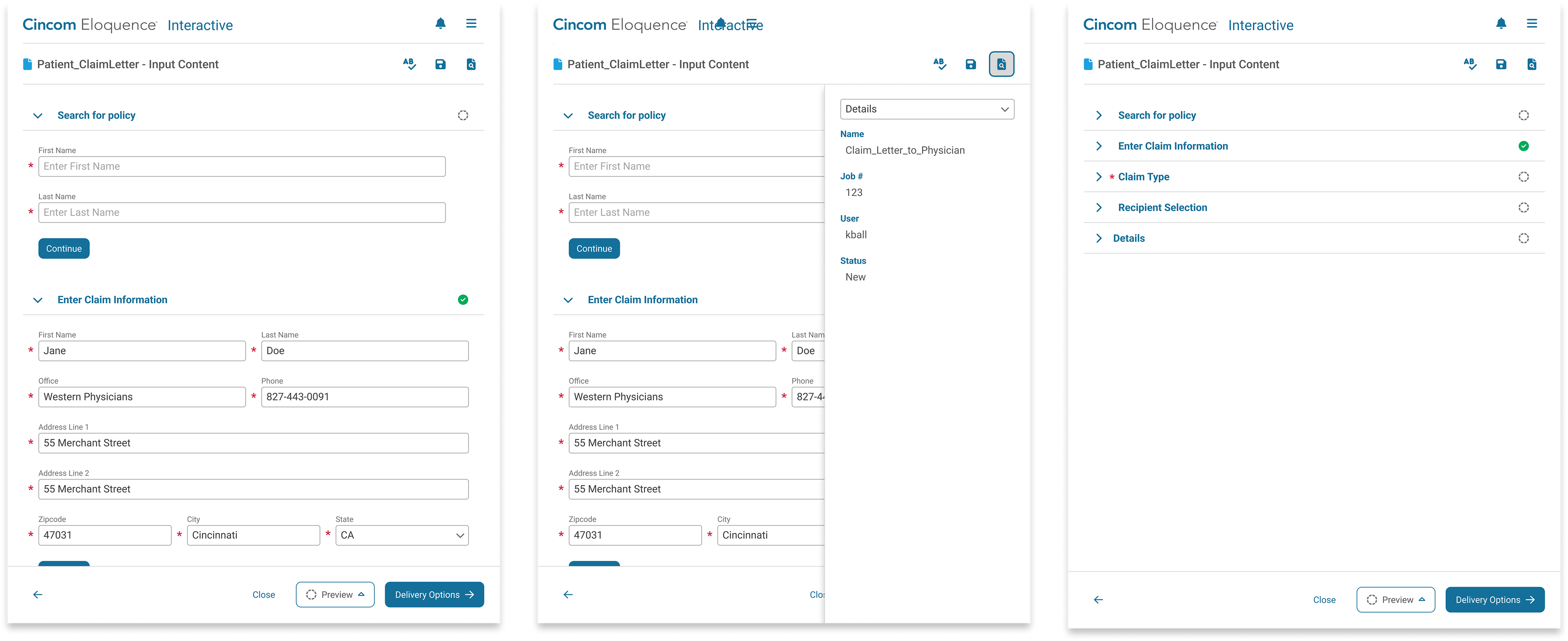
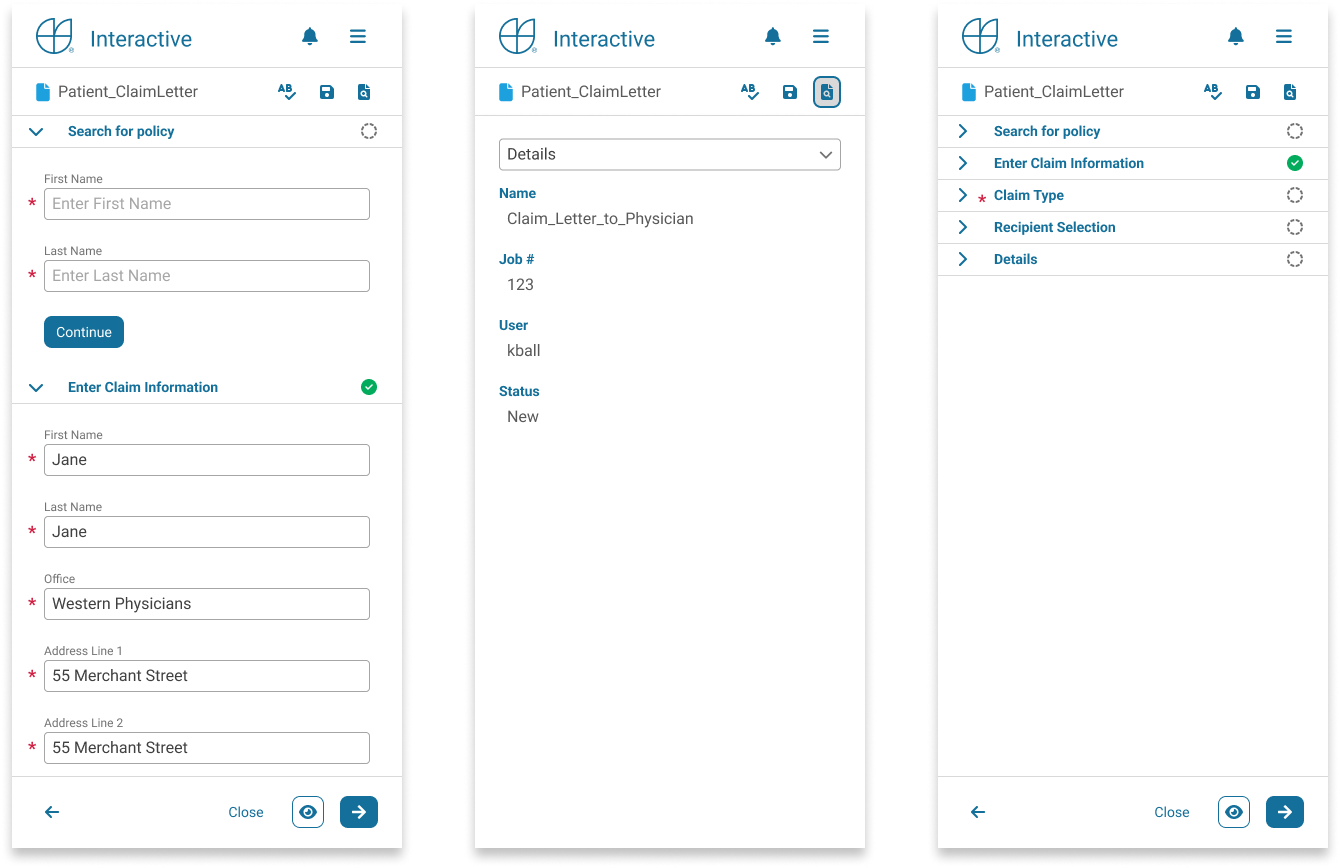
Design System Additions and Enhancements
Components and Styles
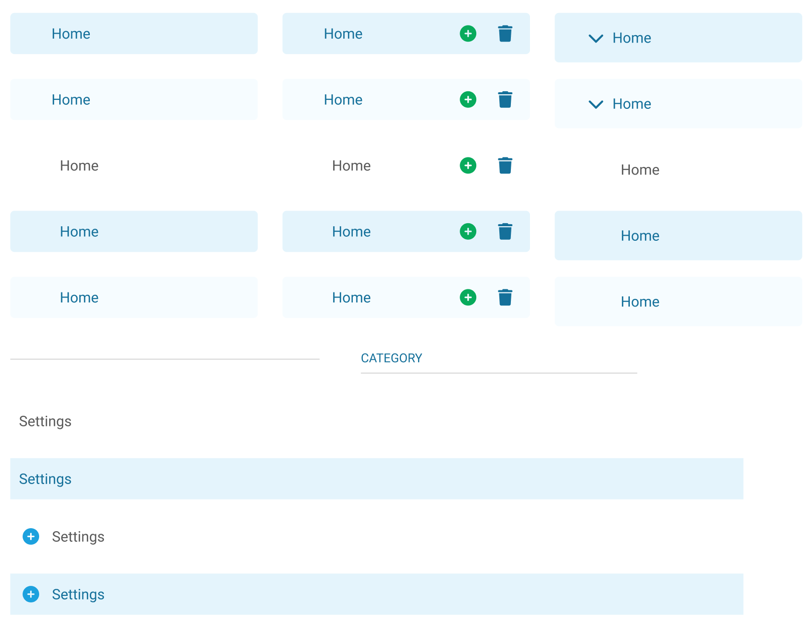
- Updated and enhanced: data table elements
- Combined and enhanced: navigation elements
- Designed heading component
- Enhanced input component
- Refined text styles and responsive behaviors
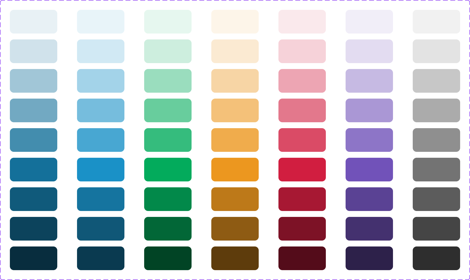
- Expanded color palette for richer visuals
System Level
- Implemented 100 scale for color and numerical values
- Redesigned information architecture of our DS from a 2-tier to a 3-tier system for more flexibility
- Filled in token holes
- Re-mapped components to new tokens
- Scoped variable options so that tokens are easier for designers to navigate